Predicting tides in R

Skip to TL/DR….

Water movement in estuaries is affected by many processes acting across space and time. Tidal exchange with the ocean is an important hydrodynamic process that can define several characteristics of an estuary. Physical flushing rates and water circulation are often controlled by tidal advection, whereas chemical and biological components are affected by the flux of dissolved or particulate components with changes in the tide. As such, describing patterns of tidal variation is a common objective of coastal researchers and environmental managers.

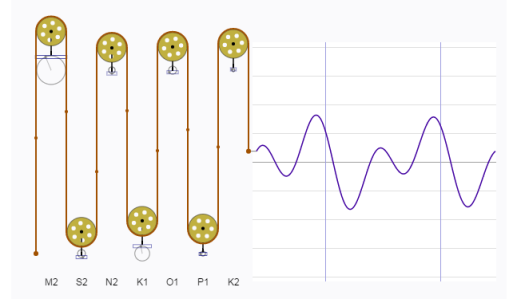
Tidal predictions are nothing new. A clever analog approach has been around since the late 1800s. The tide-predicting machine represents the tide as the summation of waves with different periods and amplitudes. Think of a continuous line plot where the repeating pattern is linked to a rotating circle, Representing the line in two-dimensions from the rotating circle creates a sine wave with the amplitude equal to the radius of the circle. A more complex plot can be created by adding the output of two or more rotating disks, where each disk varies in radius and rate of rotation. The tide-predicting machine is nothing more than a set of rotating disks linked to a single graph as the sum of the rotations from all disks. Here’s a fantastic digital representation of the tide-predicting machine:

tidemachine

Tides are caused primarily by the gravitational pull of the sun and moon on the earth’s surface. The elliptical orbits of both the moon around the earth and the earth around the sun produce periodic but unequal forces that influence water movement. These forces combined with local surface topography and large-scale circulation patterns from uneven heating of the earth’s surface lead to the variation of tidal patterns across the globe. Although complex, these periodic patterns can be characterized as the summation of sine waves, where one wave represents the effect of a single physical process (e.g., diurnal pull of the moon). Describing these forces was the objective of the earlier tide-predicting machines. Fortunately for us, modern software (i.e., R) provides us with a simpler and less expensive approach based on harmonic regression.

Approach

We’ll create and sum our own sine waves to demonstrate complexity from addition. All sine waves follow the general form y as a function of x:

sinewave

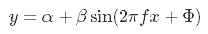
where the amplitude of the wave is beta and the frequency (or 1 / period) is f. The parameters alpha and Phi represent scalar shifts in the curve up/down and left/right, respectively. We can easily create a function in R to simulate sine waves with different characteristics. This function takes the parameters from the above equation as arguments and returns a sine wave (y) equal in length to the input time series (x). The alpha and beta are interpreted as units of wave height (e.g., meters) and f and Phi are in hours.

# function for creating sine wave
waves <- function(time_in, alpha = 0, beta = 1, freq = 24, phi = 0){

  # timestep per hour
  time_step <- 60 / unique(diff(time_in))

  # set phi as difference in hours from start of time_in
  phi <- min(time_in) + phi * 3600
  phi<- as.numeric(difftime(phi, min(time_in)))
  phi <- phi / time_step

  # get input values to cos func
  in_vals <- seq(0, length(time_in), length = length(time_in))
  in_vals <- in_vals / time_step
  in_vals <- 2 * pi * in_vals * 1 / freq

  # wave
  y <- alpha + beta * sin(in_vals + phi)

  return(y)

}

The default arguments will return a sine wave with an amplitude of one meter and frequency of one wave per 24 hours. Two additional time series are created that vary these two parameters.

# input time series for two weeks, 15 minute time step
x <- as.POSIXct(c('2017-04-01', '2017-04-15'))
x <- seq(x[1], x[2], by = 60 * 15)

# get three sine waves
# a: default
# b: amplitude 0.5, 48 hour period
# c: amplitude 2, 12 hour period
a <- waves(x)
b <- waves(x, beta = 0.5, f = 48)
c <- waves(x, beta = 2, f = 12)

We can combine all three waves in the same data object, take the summation, and plot to see how it looks.

# for data munging and plotting
library(tidyverse)

# get sum of all y values, combine to single object
yall <- rowSums(cbind(a, b, c))
dat <- data.frame(x, a, b, c, yall) %>% 
  gather('var', 'val', -x)

# plot
ggplot(dat, aes(x = x, y = val)) + 
  geom_line() + 
  facet_wrap(~var, ncol = 1) + 
  theme_bw()

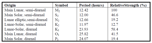
The important piece of information we get from the plot is that adding simple sine waves can create complex patterns. As a general rule, about 83% of the variation in tides is created by seven different harmonic components that, when combined, lead to the complex patterns we observe from monitoring data. These components are described as being of lunar or solar origin and relative periods occurring either once or twice daily. For example, the so-called ‘M2’ component is typically the dominant tidal wave caused by the moon, twice daily. The periods of tidal components are constant across locations but the relative strength (amplitudes) vary considerably.

maincomponents

The oce package in R has a nifty function for predicting up to 69 different tidal constituents. You’ll typically only care about the main components above but it’s useful to appreciate the variety of components included in a tidal signal. We’ll apply the tidem function from oce to predict the tidal components on a subset of SWMP data. A two-week period from the Apalachicola Bay Dry Bar station is used.

library(SWMPr)
library(oce)

# clean, one hour time step, subset, fill gaps
dat <- qaqc(apadbwq) %>% 
  setstep(timestep = 60) %>% 
  subset(subset = c('2013-01-01 0:0', '2013-12-31 0:0'), select = 'depth') %>% 
  na.approx(maxgap = 1e6)

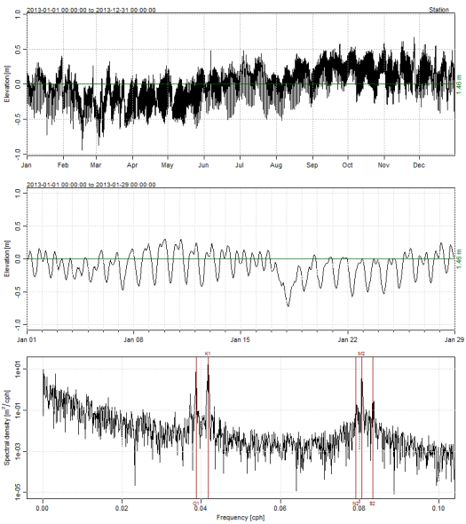
The tidem function from oce requires a ‘sealevel’ object as input. Plotting the sealevel object using the plot method from oce shows three panels; the first is the complete time series, second is the first month in the record, and third is a spectral decomposition of the tidal components as cycles per hour (cph, or period).

datsl <- as.sealevel(elevation = dat$depth, time = dat$datetimestamp)
plot(datsl)

We can create a model to estimate the components from the table above using tidem. Here, we estimate each component separately to extract predictions for each, which we then sum to estimate the complete time series.

# tidal components to estimate
constituents <- c('M2', 'S2', 'N2', 'K2', 'K1', 'O1', 'P1')

# loop through tidal components, predict each with tidem
preds <- sapply(constituents, function(x){
  
    mod <- tidem(t = datsl, constituent = x)
    pred <- predict(mod)
    pred - mean(pred)
    
  }) 

# combine prediction, sum, add time data
predall <- rowSums(preds) + mean(datsl[['elevation']])
preds <- data.frame(time = datsl[['time']], preds, Estimated = predall) 

head(preds)
## time M2 S2 N2 K2
## 1 2013-01-01 00:00:00 -0.111578526 -0.020833606 0.000215982 -0.0048417234
## 2 2013-01-01 01:00:00 -0.118544835 -0.008940681 0.006428260 -0.0093752262
## 3 2013-01-01 02:00:00 -0.095806627 0.005348532 0.011088593 -0.0113830570
## 4 2013-01-01 03:00:00 -0.049059634 0.018205248 0.013072149 -0.0103243372
## 5 2013-01-01 04:00:00 0.009986414 0.026184523 0.011900172 -0.0064842694
## 6 2013-01-01 05:00:00 0.066540974 0.027148314 0.007855534 -0.0008973087
## K1 O1 P1 Estimated
## 1 0.0911501572 0.01312209 0.0381700294 1.463683
## 2 0.0646689921 0.03909021 0.0340807303 1.465686
## 3 0.0337560517 0.06274939 0.0276811946 1.491713
## 4 0.0005294868 0.08270543 0.0194051690 1.532812
## 5 -0.0327340223 0.09778235 0.0098135843 1.574727
## 6 -0.0637552642 0.10709170 -0.0004434629 1.601819

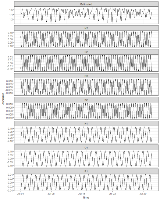
Plotting two weeks from the estimated data shows the results. Note the variation in amplitude between the components. The M2 , K1, and O1 components are the largest at this location. Also note the clear spring/neap variation in range every two weeks for the combined time series. This complex fort-nightly variation is caused simply by adding the separate sine waves.

# prep for plot
toplo <- preds %>% 
  gather('component', 'estimate', -time) %>% 
  mutate(component = factor(component, level = c('Estimated', constituents)))

# plot two weeks
ggplot(toplo, aes(x = time, y = estimate, group = component)) + 
  geom_line() + 
  scale_x_datetime(limits = as.POSIXct(c('2013-07-01', '2013-07-31'))) + 
  facet_wrap(~component, ncol = 1, scales = 'free_y') + 
  theme_bw() 

All tidal components can of course be estimated together. By default, the tidem function estimates all 69 tidal components. Looking at our components of interest shows the same estimated amplitudes in the plot above.

# estimate all components together
mod <- tidem(t = datsl)

# get components of interest
amps <- data.frame(mod@data[c('name', 'amplitude')]) %>% 
  filter(name %in% constituents) %>% 
  arrange(amplitude)
amps
## name amplitude
## 1 K2 0.01091190
## 2 N2 0.01342395
## 3 S2 0.02904518
## 4 P1 0.04100388
## 5 O1 0.11142455
## 6 M2 0.12005114
## 7 K1 0.12865764

And of course comparing the model predictions with the observed data is always a good idea.

# add predictions to observed data
dat$Estimated <- predict(mod)

# plot one month
ggplot(dat, aes(x = datetimestamp, y = depth)) + 
  geom_point() + 
  geom_line(aes(y = Estimated), colour = 'blue') + 
  scale_x_datetime(limits = as.POSIXct(c('2013-07-01', '2013-07-31'))) + 
  scale_y_continuous(limits = c(0.9, 2)) +
  theme_bw() 

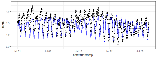
The fit is not perfect but this could be from several reasons, none of which are directly related to the method – instrument drift, fouling, water movement from non-tidal sources, etc. The real value of the model is we can use it to fill missing observations in tidal time series or to predict future observations. We also get reasonable estimates of the main tidal components, i.e., which physical forces are really driving the tide and how large are the contributions. For example, our data from Apalachicola Bay showed that the tide is driven primarily by the M2, K1, and O1 components, where each had relative amplitudes of about 0.1 meter. This is consistent with general patterns of micro-tidal systems in the Gulf of Mexico. Comparing tidal components in other geographic locations would produce very different results, both in the estimated amplitudes and the dominant components.
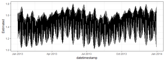
TL/DR

Here’s how to estimate the tide from an observed time series. The data are from SWMPr and the tidem model is from oce.

library(SWMPr)
library(oce)

# clean input data, one hour time step, subset, fill gaps
dat <- qaqc(apadbwq) %>% 
  setstep(timestep = 60) %>% 
  subset(., subset = c('2013-01-01 0:0', '2013-12-31 0:0'), select = 'depth') %>% 
  na.approx(maxgap = 1e6)

# get model
datsl <- as.sealevel(elevation = dat$depth, time = dat$datetimestamp)
mod <- tidem(t = datsl)

# add predictions to observed data
dat$Estimated <- predict(mod)

# plot
ggplot(dat, aes(x = datetimestamp, y = Estimated)) + 
  geom_line() +
  theme_bw() 


Reinventing the wheel for ordination biplots with ggplot2

I’ll be the first to admit that the topic of plotting ordination results using ggplot2 has been visited many times over. As is my typical fashion, I started creating a package for this purpose without completely searching for existing solutions. Specifically, the ggbiplot and factoextra packages already provide almost complete coverage of plotting results from multivariate and ordination analyses in R. Being the stubborn individual, I couldn’t give up on my own package so I started exploring ways to improve some of the functionality of biplot methods in these existing packages. For example, ggbiplot and factoextra work almost exclusively with results from principal components analysis, whereas numerous other multivariate analyses can be visualized using the biplot approach. I started to write methods to create biplots for some of the more common ordination techniques, in addition to all of the functions I could find in R that conduct PCA. This exercise became very boring very quickly so I stopped adding methods after the first eight or so. That being said, I present this blog as a sinking ship that was doomed from the beginning, but I’m also hopeful that these functions can be built on by others more ambitious than myself.

The process of adding methods to a default biplot function in ggplot was pretty simple and not the least bit interesting. The default ggpord biplot function (see here) is very similar to the default biplot function from the stats base package. Only two inputs are used, the first being a two column matrix of the observation scores for each axis in the biplot and the second being a two column matrix of the variable scores for each axis. Adding S3 methods to the generic function required extracting the relevant elements from each model object and then passing them to the default function. Easy as pie but boring as hell.

I’ll repeat myself again. This package adds nothing new to the functionality already provided by ggbiplot and factoextra. However, I like to think that I contributed at least a little bit by adding more methods to the biplot function. On top of that, I’m also naively hopeful that others will be inspired to fork my package and add methods. Here you can view the raw code for the ggord default function and all methods added to that function. Adding more methods is straightforward, but I personally don’t have any interest in doing this myself. So who wants to help??

Visit the package repo here or install the package as follows.

library(devtools)
install_github('fawda123/ggord')
library(ggord)

Available methods and examples for each are shown below. These plots can also be reproduced from the examples in the ggord help file.

##  [1] ggord.acm      ggord.ca       ggord.coa      ggord.default 
##  [5] ggord.lda      ggord.mca      ggord.MCA      ggord.metaMDS 
##  [9] ggord.pca      ggord.PCA      ggord.prcomp   ggord.princomp
# principal components analysis with the iris data set
# prcomp
ord <- prcomp(iris[, 1:4])

p <- ggord(ord, iris$Species)
p

p + scale_colour_manual('Species', values = c('purple', 'orange', 'blue'))

p + theme_classic()

p + theme(legend.position = 'top')

p + scale_x_continuous(limits = c(-2, 2))

# principal components analysis with the iris dataset
# princomp
ord <- princomp(iris[, 1:4])

ggord(ord, iris$Species)

# principal components analysis with the iris dataset
# PCA
library(FactoMineR)

ord <- PCA(iris[, 1:4], graph = FALSE)

ggord(ord, iris$Species)

# principal components analysis with the iris dataset
# dudi.pca
library(ade4)

ord <- dudi.pca(iris[, 1:4], scannf = FALSE, nf = 4)

ggord(ord, iris$Species)

# multiple correspondence analysis with the tea dataset
# MCA
data(tea)
tea <- tea[, c('Tea', 'sugar', 'price', 'age_Q', 'sex')]

ord <- MCA(tea[, -1], graph = FALSE)

ggord(ord, tea$Tea)

# multiple correspondence analysis with the tea dataset
# mca
library(MASS)

ord <- mca(tea[, -1])

ggord(ord, tea$Tea)

# multiple correspondence analysis with the tea dataset
# acm
ord <- dudi.acm(tea[, -1], scannf = FALSE)

ggord(ord, tea$Tea)

# nonmetric multidimensional scaling with the iris dataset
# metaMDS
library(vegan)
ord <- metaMDS(iris[, 1:4])

ggord(ord, iris$Species)

# linear discriminant analysis
# example from lda in MASS package
ord <- lda(Species ~ ., iris, prior = rep(1, 3)/3)

ggord(ord, iris$Species)

# correspondence analysis
# dudi.coa
ord <- dudi.coa(iris[, 1:4], scannf = FALSE, nf = 4)

ggord(ord, iris$Species)

# correspondence analysis
# ca
library(ca)
ord <- ca(iris[, 1:4])

ggord(ord, iris$Species)

Cheers,

Marcus

Some love for ggplot2

With all the recent buzz about ggvis (this, this, and this) it’s often easy to forget all that ggplot2 offers as a graphics package. True, ggplot is a static approach to graphing unlike ggvis but it has fundamentally changed the way we think about plots in R. I recently spent some time thinking about some of the more useful features of ggplot2 to answer the question ‘what is offered by ggplot2 that one can’t do with the base graphics functions?’ First-time users of ggplot2 are often confused by the syntax, yet it is precisely this syntax built on the philosophy of the grammar of graphics that makes ggplot2 so powerful. Adding content layers to mapped objects are central to this idea, which allows linking of map aesthetics through a logical framework. Additionally, several packages have been developed around this philosophy to extend the functionality of ggplot2 in alternative applications (e.g., ggmap, GGally, ggthemes).

I recently gave a presentation to describe some of my favorite features of ggplot2 and other packages building on its core concepts. I describe the use of facets for multi-panel plots, default and custom themes, ggmap for spatial mapping with ggplot2, and GGally for generalized pairs plots. Although this is certainly a subjective and incomplete list, my workflows have become much more efficient (and enjoyable) by using these tools. Below is a link to the presentation. Note that this will not load using internet explorer and you may have to reload if using Chrome to get the complete slide deck. This is my first time hosting a Slidify presentation on RPubs, so please bear with me. The presentation materials are also available at Github.

ggplot2 redux.

What are some of your favorite features of ggplot2??

Cheers,

Marcus

How much code have you written?

This past week I attended the National Water Quality Monitoring Conference in Cincinnati. Aside from spending my time attending talks, workshops, and meeting like-minded individuals, I spent an unhealthy amount of time in the hotel bar working on this blog post. My past experiences mixing coding and beer have suggested the two don’t mix, but I was partly successful in writing a function that will be the focus of this post.

I’ve often been curious how much code I’ve written over the years since most of my professional career has centered around using R in one form or another. In the name of ridiculous self-serving questions, I wrote a function for quantifying code lengths by file type. I would describe myself as somewhat of a hoarder with my code in that nothing ever gets deleted. Getting an idea of the total amount was a simple exercise in finding the files, enumerating the file contents, and displaying the results in a sensible manner.

I was not surprised that several functions in R already exist for searching for file paths in directory trees. The list.files function can be used to locate files using regular expression matching, whereas the file.info function can be used to get descriptive information for each file. I used both in my function to find files in a directory tree through recursive searching of paths with a given extension name. The date the files was last modified is saved, and the file length, as lines or number of characters, is saved after reading the file with readLines. The output is a data frame for each file with the file name, type, length, cumulative length by file type, and date. The results can be easily plotted, as shown below.

The function, obtained here, has the following arguments:

root Character string of root directory to search
file_typs Character vector of file types to search, file types must be compatible with readLines
omit_blank Logical indicating of blank lines are counted, default TRUE
recursive Logical indicating if all directories within root are searched, default TRUE
lns Logical indicating if lines in each file are counted, default TRUE, otherwise characters are counted
trace Logical for monitoring progress, default TRUE

Here’s an example using the function to search a local path on my computer.

# import function from Github
library(devtools)

# https://gist.github.com/fawda123/20688ace86604259de4e
source_gist('20688ace86604259de4e')

# path to search and file types
root <- 'C:/Projects'
file_typs <- c('r','py', 'tex', 'rnw')

# get data from function
my_fls <- file.lens(root, file_typs)

head(my_fls)

##                               fl Length       Date cum_len Type
## 1                 buffer loop.py     29 2010-08-12      29   py
## 2                  erase loop.py     22 2010-08-12      51   py
## 3 remove selection and rename.py     26 2010-08-16      77   py
## 4              composite loop.py     32 2010-08-18     109   py
## 5                extract loop.py     61 2010-08-18     170   py
## 6         classification loop.py     32 2010-08-19     202   py

In this example, I’ve searched for R, Python, LaTeX, and Sweave files in the directory ‘C:/Projects/’. The output from the function is shown using the head command.

Here’s some code for plotting the data. I’ve created four plots with ggplot and combined them using grid.arrange from the gridExtra package. The first plot shows the number of files by type, the second shows file length by date and type, the third shows a frequency distribution of file lengths by type, and the fourth shows a cumulative distribution of file lengths by type and date.

# plots
library(ggplot2)
library(gridExtra)

# number of files by type
p1 <- ggplot(my_fls, aes(x = Type, fill = Type)) +
	geom_bar() + 
	ylab('Number of files') +
	theme_bw()

# file length by type and date
p2 <- ggplot(my_fls, aes(x = Date, y = Length, group = Type, 
	colour = Type)) +
	geom_line() +
	ylab('File length') +
	geom_point() +
	theme_bw() +
	theme(legend.position = 'none')

# density of file length by type
p3 <- ggplot(my_fls, aes(x = Length, y = ..scaled.., group = Type, 
	colour = Type, fill = Type)) +
	geom_density(alpha = 0.25, size = 1) +
	xlab('File length') +
	ylab('Density (scaled)') +
	theme_bw() +
	theme(legend.position = 'none')

# cumulative length by file type and date
p4 <- ggplot(my_fls, aes(x = Date, y = cum_len, group = Type, 
	colour = Type)) + 
	geom_line() + 
	geom_point() + 
	ylab('Cumulative file length') +
	theme_bw() +
	theme(legend.position = 'none')

# function for common legend
# https://github.com/hadley/ggplot2/wiki/Share-a-legend-between-two-ggplot2-graphs
g_legend<-function(a.gplot){
  tmp <- ggplot_gtable(ggplot_build(a.gplot))
  leg <- which(sapply(tmp$grobs, function(x) x$name) == "guide-box")
  legend <- tmp$grobs[[leg]]
  return(legend)}

# get common legend, remove from p1
mylegend <- g_legend(p1)
p1 <- p1 + theme(legend.position = 'none')

# final plot
grid.arrange(
	arrangeGrob(p1, p2, p3, p4, ncol = 2),
	mylegend, 
	ncol = 2, widths = c(10,1))
Fig: Summary of results from the file.lens function. Number of lines per file is the unit of measurement.


Clearly, most of my work has been done in R, with most files being less than 200-300 lines. There seems to be a lull of activity in Mid 2013 after I finished my dissertation, which is entirely expected. I was surprised to see that the Sweave (.rnw) and LaTeX files weren’t longer until I remembered that paragraphs in these files are interpreted as single lines of text. I re-ran the function using characters as my unit of my measurement.

# get file lengths by character
my_fls <- file.lens(root, file_typs, lns = F)

# re-run plot functions above
Fig: Summary of results from the file.lens function. Number of characters per file is the unit of measurement.


Now there are clear differences in lengths for the Sweave and LaTeX files, with the longest file topping out at 181256 characters.

I know others might be curious to see how much code they’ve written so feel free to use/modify the function as needed. These figures represent all of my work, fruitful or not, in six years of graduate school. It goes without saying that all of your code has to be in the root directory. The totals will obviously be underestimates if you have code elsewhere, such as online. The function could be modified for online sources but I think I’m done for now.

Cheers,

Marcus

Visualizing neural networks in R – update

In my last post I said I wasn’t going to write anymore about neural networks (i.e., multilayer feedforward perceptron, supervised ANN, etc.). That was a lie. I’ve received several requests to update the neural network plotting function described in the original post. As previously explained, R does not provide a lot of options for visualizing neural networks. The only option I know of is a plotting method for objects from the neuralnet package. This may be my opinion, but I think this plot leaves much to be desired (see below). Also, no plotting methods exist for neural networks created in other packages, i.e., nnet and RSNNS. These packages are the only ones listed on the CRAN task view, so I’ve updated my original plotting function to work with all three. Additionally, I’ve added a new option for plotting a raw weight vector to allow use with neural networks created elsewhere. This blog describes these changes, as well as some new arguments added to the original function.

Fig: A neural network plot created using functions from the neuralnet package.


As usual, I’ll simulate some data to use for creating the neural networks. The dataset contains eight input variables and two output variables. The final dataset is a data frame with all variables, as well as separate data frames for the input and output variables. I’ve retained separate datasets based on the syntax for each package.

library(clusterGeneration)

seed.val<-2
set.seed(seed.val)

num.vars<-8
num.obs<-1000

#input variables
cov.mat<-genPositiveDefMat(num.vars,covMethod=c("unifcorrmat"))$Sigma
rand.vars<-mvrnorm(num.obs,rep(0,num.vars),Sigma=cov.mat)

#output variables
parms<-runif(num.vars,-10,10)
y1<-rand.vars %*% matrix(parms) + rnorm(num.obs,sd=20)
parms2<-runif(num.vars,-10,10)
y2<-rand.vars %*% matrix(parms2) + rnorm(num.obs,sd=20)

#final datasets
rand.vars<-data.frame(rand.vars)
resp<-data.frame(y1,y2)
names(resp)<-c('Y1','Y2')
dat.in<-data.frame(resp,rand.vars)

The various neural network packages are used to create separate models for plotting.

#nnet function from nnet package
library(nnet)
set.seed(seed.val)
mod1<-nnet(rand.vars,resp,data=dat.in,size=10,linout=T)

#neuralnet function from neuralnet package, notice use of only one response
library(neuralnet)
form.in<-as.formula('Y1~X1+X2+X3+X4+X5+X6+X7+X8')
set.seed(seed.val)
mod2<-neuralnet(form.in,data=dat.in,hidden=10)

#mlp function from RSNNS package
library(RSNNS)
set.seed(seed.val)
mod3<-mlp(rand.vars, resp, size=10,linOut=T)

I’ve noticed some differences between the functions that could lead to some confusion. For simplicity, the above code represents my interpretation of the most direct way to create a neural network in each package. Be very aware that direct comparison of results is not advised given that the default arguments differ between the packages. A few key differences are as follows, although many others should be noted. First, the functions differ in the methods for passing the primary input variables. The nnet function can take separate (or combined) x and y inputs as data frames or as a formula, the neuralnet function can only use a formula as input, and the mlp function can only take a data frame as combined or separate variables as input. As far as I know, the neuralnet function is not capable of modelling multiple response variables, unless the response is a categorical variable that uses one node for each outcome. Additionally, the default output for the neuralnet function is linear, whereas the opposite is true for the other two functions.

Specifics aside, here’s how to use the updated plot function. Note that the same syntax is used to plot each model.

#import the function from Github
library(devtools)
source_url('https://gist.githubusercontent.com/fawda123/7471137/raw/466c1474d0a505ff044412703516c34f1a4684a5/nnet_plot_update.r')

#plot each model
plot.nnet(mod1)
plot.nnet(mod2)
plot.nnet(mod3)
Fig: A neural network plot using the updated plot function and a nnet object (mod1).


Fig: A neural network plot using the updated plot function and a neuralnet object (mod2).


Fig: A neural network plot using the updated plot function and a mlp object (mod3).


The neural networks for each model are shown above. Note that only one response variable is shown for the second plot. Also, neural networks created using mlp do not show bias layers, causing a warning to be returned. The documentation about bias layers for this function is lacking, although I have noticed that the model object returned by mlp does include information about ‘unitBias’ (see the output from mod3$snnsObject$getUnitDefinitions()). I wasn’t sure what this was so I excluded it from the plot. Bias layers aren’t all that informative anyway, since they are analogous to intercept terms in a regression model. Finally, the default variable labels differ for the mlp plot from the other two. I could not find any reference to the original variable names in the mlp object, so generic names returned by the function are used.

I have also added five new arguments to the function. These include options to remove bias layers, remove variable labels, supply your own variable labels, and include the network architecture if using weights directly as input. The new arguments are shown in bold.

mod.in neural network object or numeric vector of weights, if model object must be from nnet, mlp, or neuralnet functions
nid logical value indicating if neural interpretation diagram is plotted, default T
all.out character string indicating names of response variables for which connections are plotted, default all
all.in character string indicating names of input variables for which connections are plotted, default all
bias logical value indicating if bias nodes and connections are plotted, not applicable for networks from mlp function, default T
wts.only logical value indicating if connections weights are returned rather than a plot, default F
rel.rsc numeric value indicating maximum width of connection lines, default 5
circle.cex numeric value indicating size of nodes, passed to cex argument, default 5
node.labs logical value indicating if labels are plotted directly on nodes, default T
var.labs logical value indicating if variable names are plotted next to nodes, default T
x.lab character string indicating names for input variables, default from model object
y.lab character string indicating names for output variables, default from model object
line.stag numeric value that specifies distance of connection weights from nodes
struct numeric value of length three indicating network architecture(no. nodes for input, hidden, output), required only if mod.in is a numeric vector
cex.val numeric value indicating size of text labels, default 1
alpha.val numeric value (0-1) indicating transparency of connections, default 1
circle.col character string indicating color of nodes, default ‘lightblue’, or two element list with first element indicating color of input nodes and second indicating color of remaining nodes
pos.col character string indicating color of positive connection weights, default ‘black’
neg.col character string indicating color of negative connection weights, default ‘grey’
max.sp logical value indicating if space between nodes in each layer is maximized, default F
... additional arguments passed to generic plot function

The plotting function can also now be used with an arbitrary weight vector, rather than a specific model object. The struct argument must also be included if this option is used. I thought the easiest way to use the plotting function with your own weights was to have the input weights as a numeric vector, including bias layers. I’ve shown how this can be done using the weights directly from mod1 for simplicity.

wts.in<-mod1$wts
struct<-mod1$n
plot.nnet(wts.in,struct=struct)

Note that wts.in is a numeric vector with length equal to the expected given the architecture (i.e., for 8 10 2 network, 100 connection weights plus 12 bias weights). The plot should look the same as the plot for the neural network from nnet.

The weights in the input vector need to be in a specific order for correct plotting. I realize this is not clear by looking directly at wt.in but this was the simplest approach I could think of. The weight vector shows the weights for each hidden node in sequence, starting with the bias input for each node, then the weights for each output node in sequence, starting with the bias input for each output node. Note that the bias layer has to be included even if the network was not created with biases. If this is the case, simply input a random number where the bias values should go and use the argument bias=F. I’ll show the correct order of the weights using an example with plot.nn from the neuralnet package since the weights are included directly on the plot.

Fig: Example from the neuralnet package showing model weights.


If we pretend that the above figure wasn’t created in R, we would input the mod.in argument for the updated plotting function as follows. Also note that struct must be included if using this approach.

mod.in<-c(13.12,1.49,0.16,-0.11,-0.19,-0.16,0.56,-0.52,0.81)
struct<-c(2,2,1) #two inputs, two hidden, one output 
plot.nnet(mod.in,struct=struct)
Fig: Use of the plot.nnet function by direct input of model weights.


Note the comparability with the figure created using the neuralnet package. That is, larger weights have thicker lines and color indicates sign (+ black, – grey).

One of these days I’ll actually put these functions in a package. In the mean time, please let me know if any bugs are encountered.

Cheers,

Marcus

Update:

I’ve changed the function to work with neural networks created using the train function from the caret package. The link above is updated but you can also grab it here.

mod4<-train(Y1~.,method='nnet',data=dat.in,linout=T)
plot.nnet(mod4,nid=T)

Also, factor levels are now correctly plotted if using the nnet function.

fact<-factor(sample(c('a','b','c'),size=num.obs,replace=T))
form.in<-formula('cbind(Y2,Y1)~X1+X2+X3+fact')
mod5<-nnet(form.in,data=cbind(dat.in,fact),size=10,linout=T)
plot.nnet(mod5,nid=T)

Update 2:

More updates… I’ve now modified the function to plot multiple hidden layers for networks created using the mlp function in the RSNNS package and neuralnet in the neuralnet package. As far as I know, these are the only neural network functions in R that can create multiple hidden layers. All others use a single hidden layer. I have not tested the plotting function using manual input for the weight vectors with multiple hidden layers. My guess is it won’t work but I can’t be bothered to change the function unless it’s specifically requested. The updated function can be grabbed here (all above links to the function have also been changed).

library(RSNNS)

#neural net with three hidden layers, 9, 11, and 8 nodes in each
mod<-mlp(rand.vars, resp, size=c(9,11,8),linOut=T)
par(mar=numeric(4),family='serif')
plot.nnet(mod)
Fig: Use of the updated plot.nnet function with multiple hidden layers from a network created with mlp.


Here’s an example using the neuralnet function with binary predictors and categorical outputs (credit to Tao Ma for the model code).

library(neuralnet)

#response
AND<-c(rep(0,7),1)
OR<-c(0,rep(1,7))

#response with predictors
binary.data<-data.frame(expand.grid(c(0,1),c(0,1),c(0,1)),AND,OR)

#model
net<-neuralnet(AND+OR~Var1+Var2+Var3, binary.data,hidden=c(6,12,8),rep=10,err.fct="ce",linear.output=FALSE)

#plot ouput
par(mar=numeric(4),family='serif')
plot.nnet(net)
Fig: Use of the updated plot.nnet function with multiple hidden layers from a network created with neuralnet.


Update 3:

The color vector argument (circle.col) for the nodes was changed to allow a separate color vector for the input layer. The following example shows how this can be done using relative importance of the input variables to color-code the first layer.

#example showing use of separate colors for input layer
#color based on relative importance using 'gar.fun'

##
#create input data
seed.val<-3
set.seed(seed.val)
 
num.vars<-8
num.obs<-1000
 
#input variables
library(clusterGeneration)
cov.mat<-genPositiveDefMat(num.vars,covMethod=c("unifcorrmat"))$Sigma
rand.vars<-mvrnorm(num.obs,rep(0,num.vars),Sigma=cov.mat)
 
#output variables
parms<-runif(num.vars,-10,10)
y1<-rand.vars %*% matrix(parms) + rnorm(num.obs,sd=20)

#final datasets
rand.vars<-data.frame(rand.vars)
resp<-data.frame(y1)
names(resp)<-'Y1'
dat.in<-data.frame(resp,rand.vars)

##
#create model
library(nnet)
mod1<-nnet(rand.vars,resp,data=dat.in,size=10,linout=T)

##
#relative importance function
library(devtools)
source_url('https://gist.github.com/fawda123/6206737/raw/2e1bc9cbc48d1a56d2a79dd1d33f414213f5f1b1/gar_fun.r')

#relative importance of input variables for Y1
rel.imp<-gar.fun('Y1',mod1,bar.plot=F)$rel.imp

#color vector based on relative importance of input values
cols<-colorRampPalette(c('green','red'))(num.vars)[rank(rel.imp)]

##
#plotting function
source_url('https://gist.githubusercontent.com/fawda123/7471137/raw/466c1474d0a505ff044412703516c34f1a4684a5/nnet_plot_update.r')
 
#plot model with new color vector
#separate colors for input vectors using a list for 'circle.col'
plot(mod1,circle.col=list(cols,'lightblue'))
Fig: Use of the updated plot.nnet function with input nodes color-coded in relation to relative importance.


A nifty area plot (or a bootleg of a ggplot geom)

The ideas for most of my blogs usually come from half-baked attempts to create some neat or useful feature that hasn’t been implemented in R. These ideas might come from some analysis I’ve used in my own research or from some other creation meant to save time. More often than not, my blogs are motivated by data visualization techniques meant to provide useful ways of thinking about analysis results or comparing pieces of information. I was particularly excited (anxious?) after I came across this really neat graphic that ambitiously portrays the progression of civilization since ca. BC 2000. The original image was created John B. Sparks and was first printed by Rand McNally in 1931.1 The ‘Histomap’ illustrates the rise and fall of various empires and civilizations through an increasing time series up to present day. Color-coded chunks at each time step indicate the relative importance or dominance of each group. Although the methodology by which ‘relative dominance’ was determined is unclear, the map provides an impressive synopsis of human history.

histomap_ex
Fig: Snippet of the histomap. See the footnote for full link.1


Historical significance aside, I couldn’t help but wonder if a similar figure could be reproduced in R (I am not a historian). I started work on a function to graphically display the relative importance of categorical data across a finite time series. After a few hours of working, I soon realized that plot functions in the ggplot2 package can already accomplish this task. Specifically, the geom_area ‘geom’ provides a ‘continuous analog of a stacked bar chart, and can be used to show how composition of the whole varies over the range of x’.2 I wasn’t the least bit surprised that this functionality was already available in ggplot2. Rather than scrapping my function entirely, I decided to stay the course in the naive hope that a stand-alone function that was independent of ggplot2 might be useful. Consider this blog my attempt at ripping-off some ideas from Hadley Wickham.

The first question that came to mind when I started the function was the type of data to illustrate. The data should illustrate changes in relative values (abundance?) for different categories or groups across time. The only assumption is that the relative values are all positive. Here’s how I created some sample data:

#create data
set.seed(3)

#time steps
t.step<-seq(0,20)

#group names
grps<-letters[1:10]

#random data for group values across time
grp.dat<-runif(length(t.step)*length(grps),5,15)

#create data frame for use with plot
grp.dat<-matrix(grp.dat,nrow=length(t.step),ncol=length(grps))
grp.dat<-data.frame(grp.dat,row.names=t.step)
names(grp.dat)<-grps

The code creates random data from a uniform distribution for ten groups of variables across twenty time steps. The approach is similar to the method used in my blog about a nifty line plot. The data defined here can also be used with the line plot as an alternative approach for visualization. The only difference between this data format and the latter is that the time steps in this example are the row names, rather than a separate column. The difference is trivial but in hindsight I should have kept them the same for compatibility between plotting functions. The data have the following form for the first four groups and first three time steps.

a b c d
0 6.7 5.2 6.7 6.0
1 13.1 6.3 10.7 12.7
2 8.8 5.9 9.2 8.0
3 8.3 7.4 7.7 12.7

The plotting function, named plot.area, can be imported and implemented as follows (or just copy from the link):

source("https://gist.github.com/fawda123/6589541/raw/8de8b1f26c7904ad5b32d56ce0902e1d93b89420/plot_area.r")

plot.area(grp.dat)
Fig: The plot.area function in action.


The function indicates the relative values of each group as a proportion from 0-1 by default. The function arguments are as follows:

x data frame with input data, row names are time steps
col character string of at least one color vector for the groups, passed to colorRampPalette, default is ‘lightblue’ to ‘green’
horiz logical indicating if time steps are arranged horizontally, default F
prop logical indicating if group values are displayed as relative proportions from 0–1, default T
stp.ln logical indicating if parallel lines are plotted indicating the time steps, defualt T
grp.ln logical indicating if lines are plotted connecting values of individual groups, defualt T
axs.cex font size for axis values, default 1
axs.lab logical indicating if labels are plotted on each axis, default T
lab.cex font size for axis labels, default 1
names character string of length three indicating axis names, default ‘Group’, ‘Step’, ‘Value’
... additional arguments to passed to par

I arbitrarily chose the color scheme as a ramp from light blue to green. Any combination of color values as input to colorRampPalette can be used. Individual colors for each group will be used if the number of input colors is equal to the number of groups. Here’s an example of another color ramp.

plot.area(grp.dat,col=c('red','lightgreen','purple'))
Fig: The plot.area function using a color ramp from red, light green, to purple.


The function also allows customization of the lines that connect time steps and groups.

plot.area(grp.dat,col=c('red','lightgreen','purple'),grp.ln=F)

plot.area(grp.dat,col=c('red','lightgreen','purple'),stp.ln=F)
plt-ar3plt-ar4
Fig: The plot.area function with different line customizations.

Finally, the prop argument can be used to retain the original values of the data and the horiz argument can be used to plot groups horizontally.

plot.area(grp.dat,prop=F)

plot.area(grp.dat,prop=F,horiz=T)
plt-ar52plt-ar62
Fig: The plot.area function with changing arguments for prop and horiz.

Now is a useful time to illustrate how these graphs can be replicated in ggplot2. After some quick reshaping of our data, we can create a similar plot as above (full code here):

require(ggplot2)
require(reshape)

#reshape the data
p.dat<-data.frame(step=row.names(grp.dat),grp.dat,stringsAsFactors=F)
p.dat<-melt(p.dat,id='step')
p.dat$step<-as.numeric(p.dat$step)

#create plots
p<-ggplot(p.dat,aes(x=step,y=value)) + theme(legend.position="none")
p + geom_area(aes(fill=variable)) 
p + geom_area(aes(fill=variable),position='fill')
Fig: The ggplot2 approach to plotting the data.


Same plots, right? My function is practically useless given the tools in ggplot2. However, the plot.area function is completely independent, allowing for easy manipulation of the source code. I’ll leave it up to you to decide which approach is most useful.

-Marcus

1http://www.slate.com/blogs/the_vault/2013/08/12/the_1931_histomap_the_entire_history_of_the_world_distilled_into_a_single.html
2http://docs.ggplot2.org/current/geom_area.html

A nifty line plot to visualize multivariate time series

A few days ago a colleague came to me for advice on the interpretation of some data. The dataset was large and included measurements for twenty-six species at several site-year-plot combinations. A substantial amount of effort had clearly been made to ensure every species at every site over several years was documented. I don’t pretend to hide my excitement of handling large, messy datasets, so I offered to lend a hand. We briefly discussed a few options and came to the conclusion that simple was better, at least in an exploratory sense. The challenge was to develop a plot that was informative, but also maintained the integrity of the data. Specifically, we weren’t interested in condensing information using synthetic axes created from a multivariate soup. We wanted some way to quickly identify trends over time for multiple species.

I was directed towards the excellent work by the folks at Gallup and Healthways to create a human ‘well-being index’ or WBI. This index is a composite of six different sub-indices (e.g., physical health, work environment, etc.) that provides a detailed and real-time view of American health. The annual report provides many examples of elegant and informative graphs, which we used as motivation for our current problem. In particular, page 6 of the report has a figure on the right-hand side that shows the changes in state WBI rankings from 2011 to 2012. States are ranked by well-being in descending order with lines connecting states between the two years. One could obtain the same conclusions by examining a table but the figure provides a visually pleasing and entertaining way of evaluating several pieces of information.

I’ll start by explaining the format of the data we’re using. After preparation of the raw data with plyr and reshape2 by my colleague, a dataset was created with multiple rows for each time step and multiple columns for species, indexed by site. After splitting the data frame by site (using split), the data contained only the year and species data. The rows contained species frequency occurrence values for each time step. Here’s an example for one site (using random data):

step sp1 sp2 sp3 sp4
2003 1.3 2.6 7.7 3.9
2004 3.9 4.2 2.5 1.6
2005 0.4 2.6 3.3 11.0
2006 6.9 10.9 10.5 8.4

The actual data contained a few dozen species, not to mention multiple tables for each site. Sites were also designated as treatment or control. Visual examination of each table to identify trends related to treatment was not an option given the abundance of the data for each year and site.

We’ll start by creating a synthetic dataset that we’ll want to visualize. We’ll pretend that the data are for one site, since the plot function described below handles sites individually.

#create random data
set.seed(5)

#time steps
step<-as.character(seq(2007,2012))

#species names
sp<-paste0('sp',seq(1,25))

#random data for species frequency occurrence
sp.dat<-runif(length(step)*length(sp),0,15)

#create data frame for use with plot
sp.dat<-matrix(sp.dat,nrow=length(step),ncol=length(sp))
sp.dat<-data.frame(step,sp.dat)
names(sp.dat)<-c('step',sp)

The resulting data frame contains six years of data (by row) with randomized data on frequency occurrence for 25 species (every column except the first). In order to make the plot interesting, we can induce a correlation of some of our variables with the time steps. Otherwise, we’ll be looking at random data which wouldn’t show the full potential of the plots. Let’s randomly pick four of the variables and replace their values. Two variables will decrease with time and two will increase.

#reassign values of four variables

#pick random species names
vars<-sp[sp %in% sample(sp,4)]

#function for getting value at each time step
time.fun<-function(strt.val,steps,mean.val,lim.val){
	step<-1
	x.out<-strt.val
	while(step<steps){
		x.new<-x.out[step] + rnorm(1,mean=mean.val)
		x.out<-c(x.out,x.new)
		step<-step+1
		}
	if(lim.val<=0) return(pmax(lim.val,x.out))
	else return(pmin(lim.val,x.out))
	}

#use function to reassign variable values
sp.dat[,vars[1]]<-time.fun(14.5,6,-3,0) #start at 14.5, decrease rapidly
sp.dat[,vars[2]]<-time.fun(13.5,6,-1,0) #start at 13.5, decrease less rapidly
sp.dat[,vars[3]]<-time.fun(0.5,6,3,15) #start at 0.5, increase rapidly
sp.dat[,vars[4]]<-time.fun(1.5,6,1,15) #start at 1.5, increase less rapidly

The code uses the sample function to pick the species in the data frame. Next, I’ve written a function that simulates random variables that either decrease or increase for a given number of time steps. The arguments for the function are strt.val for the initial starting value at the first time step, steps are the total number of time steps to return, mean.val determines whether the values increase or decrease with the time steps, and lim.val is an upper or lower limit for the values. Basically, the function returns values at each time step that increase or decrease by a random value drawn from a normal distribution with mean as mean.val. Obviously we could enter the data by hand, but this way is more fun. Here’s what the data look like.

Now we can use the plot to visualize changes in species frequency occurrence for the different time steps. We start by importing the function, named plot.qual, into our workspace.

require(devtools)
source_gist('5281518')

par(mar=numeric(4),family='serif')
plot.qual(sp.dat,rs.ln=c(3,15))

The figure shows species frequency occurrence from 2007 to 2012. Species are ranked in order of decreasing frequency occurrence for each year, with year labels above each column. The lines connect the species between the years. Line color is assigned based on the ranked frequency occurrence values for species in the first time step to allow better identification of a species across time. Line width is also in proportion to the starting frequency occurrence value for each species at each time step. The legend on the bottom indicates the frequency occurrence values for different line widths.

We can see how the line colors and widths help us follow species trends. For example, we randomly chose species two to decrease with time. In 2007, we see that species two is ranked as the highest frequency occurrence among all species. We see a steady decline for each time step if we follow the species through the years. Finally, species two was ranked the lowest in 2012. The line widths also decrease for species two at each time step, illustrating the continuous decrease in frequency occurrence. Similarly, we randomly chose species 15 to increase with each time step. We see that it’s second to lowest in 2007 and then increases to third highest by 2012.

We can use the sp.names argument to isolate species of interest. We can clearly see the changes we’ve defined for our four random species.

plot.qual(sp.dat,sp.names=vars)

In addition to requiring the RColorBrewer and scales packages, the plot.qual function has several arguments that affect plotting:

x data frame or matrix with input data, first column is time step
x.locs minimum and maximum x coordinates for plotting region, from 0–1
y.locs minimum and maximum y coordinates for plotting region, from 0–1
steps character string of time steps to include in plot, default all
sp.names character string of species connections to display, default all
dt.tx logical value indicating if time steps are indicated in the plot
rsc logical value indicating if line widths are scaled proportionally to their value
ln.st numeric value for distance of lines from text labels, distance is determined automatically if not provided
rs.ln two-element numeric vector for rescaling line widths, defaults to one value if one element is supplied, default 3 to 15
ln.cl character string indicating color of lines, can use multiple colors or input to brewer.pal, default ‘RdYlGn’
alpha.val numeric value (0–1) indicating transparency of connections, default 0.7
leg logical value for plotting legend, default T, values are for the original data frame, no change for species or step subsets
rnks logical value for showing only the ranks in the text labels
... additional arguments to plot

I’ve attempted to include some functionality in the arguments, such as the ability to include date names and a legend, control over line widths, line color and transparency, and which species or years are shown. A useful aspect of the line coloring is the ability to incorporate colors from RColorBrewer or multiple colors as input to colorRampPalette. The following plots show some of these features.

par(mar=c(0,0,1,0),family='serif')
plot.qual(sp.dat,rs.ln=6,ln.cl='black',alpha=0.5,dt.tx=F,
	main='No color, no legend, no line rescaling')
#legend is removed if no line rescaling

par(mfrow=c(1,2),mar=c(0,0,1,0),family='serif')
plot.qual(sp.dat,steps=c('2007','2012'),x.locs=c(0.1,0.9),leg=F)
plot.qual(sp.dat,steps=c('2007','2012'),sp.names=vars,x.locs=c(0.1,0.9),leg=F)
title('Plot first and last time step for different species',outer=T,line=-1)

par(mar=c(0,0,1,0),family='serif')
plot.qual(sp.dat,y.locs=c(0.05,1),ln.cl=c('lightblue','purple','green'),
	main='Custom color ramp')

These plots are actually nothing more than glorified line plots, but I do hope the functionality and display helps better visualize trends over time. However, an important distinction is that the plots show ranked data rather than numerical changes in frequency occurrence as in a line plot. For example, species twenty shows a decrease in rank from 2011 to 2012 (see the second plot) yet the actual data in the table shows a continuous increase across all time steps. This does not represent an error in the plot, rather it shows a discrepancy between viewing data qualitatively or quantitatively. In other words, always be aware of what a figure actually shows you.

Please let me know if any bugs are encountered or if there are any additional features that could improve the function. Feel free to grab the code here.

Animating neural networks from the nnet package

My research has allowed me to implement techniques for visualizing multivariate models in R and I wanted to share some additional techniques I’ve developed, in addition to my previous post. For example, I think a primary obstacle towards developing a useful neural network model is an under-appreciation of the effects model parameters have on model performance. Visualization techniques enable us to more fully understand how these models are developed, which can lead to more careful determination of model parameters.

Neural networks characterize relationships between explanatory and response variables through a series of training iterations. Training of the model is initiated using a random set of weighted connections between the layers. The predicted values are compared to the observed values in the training dataset. Based on the errors or differences between observed and predicted, the weights are adjusted to minimize prediction error using a ‘back-propagation algorithm’1. The process is repeated with additional training iterations until some stopping criteria is met, such as a maximum number of training iterations set by the user or convergence towards a minimum error value. This process is similar in theory to the fitting of least-squares regression lines, although neural networks incorporate many more parameters. Both methods seek to minimize an error criterion.

The development of neural networks for prediction also requires he use of test datasets for evaluating the predictive performance of the trained models. Neural networks are so effective at relating variables that they commonly characterize relationships in the training data that have no actual relevance. In other words, these models identify and characterize noise in the data rather than actual (i.e., biological, ecological, physical, etc.) relationships among variables. This concept is similar to creating a loess function with a decreasingly restrictive smoothing parameter (span argument) to model a polynomial relationship between two variables (code here):

The loess function from top left to bottom right shows how a model can be overfit. The function becomes increasingly overfit to the observed data such that the modeled relationship between x and y characterizes peculiarities of the data that have no actual relevance. The function with a decreasingly restrictive smoothing parameter might better approximate the observed points (lower root mean square error) but the ability to generalize is compromised (i.e., bias-variance tradeoff).

A neural network model that is not overfit to the training data should predict observations in a test dataset that are close to the observed. Textbooks often indicate the importance of evaluating model performance on a test dataset2, yet methods are not available in R for visualizing model performance as a function of training iterations. This blog will present an approach for visualizing the training process of neural network models using the plot.nnet function in my previous blog. I’ll also be creating animations using the animation package created by Yihui Xie.

Let’s start by creating our simulated dataset (same as my previous posts). We create eight random variables with an arbitrary correlation structure and then create a response variable as a linear combination of the eight random variables. The parameters describing the true relationship between the response and explanatory variables are known and were drawn randomly from a uniform distribution.

require(clusterGeneration)
require(nnet)

set.seed(2)
num.vars<-8
num.obs<-1000

#arbitrary correlation matrix and random variables
cov.mat<-genPositiveDefMat(num.vars,covMethod=c("unifcorrmat"))$Sigma
rand.vars<-mvrnorm(num.obs,rep(0,num.vars),Sigma=cov.mat)
parms<-runif(num.vars,-10,10)

#response variable as linear combination of random variables and random error term
y<-rand.vars %*% matrix(parms) + rnorm(num.obs,sd=20)

#prepare data for use with nnet and plot.nnet
rand.vars<-data.frame(rand.vars)
y<-data.frame((y-min(y))/(max(y)-min(y)))
names(y)<-'y'

We’ve rescaled our response variable from 0-1, as in the previous blog, so we can make use of a logistic transfer function. Here we use a linear transfer function as before, so rescaling is not necessary but this does allow for comparability should we choose to use a logistic transfer function.

Now we import the plot function from Github (thanks to Harald’s tip in my previous post).

require(devtools)
source_gist('5086859') #loaded as 'plot.nnet' in the workspace

Now we’re going to train a neural network model from one to 100 training iterations to see how error changes for a training and test dataset. The nnet function returns training errors but only after each of ten training iterations (trace argument set to true). We could plot these errors but the resolution is rather poor. We also can’t track error for the test dataset. Instead, we can use a loop to train the model up to a given set of iterations. After each iteration, we can save the error for each dataset in an object. The loop will start again with the maximum number of training iterations as n + 1, where n was the maximum number of training iterations in the previous loop. This is not the most efficient way to track errors but it works for our purposes.

First, we’ll have to define a vector that identifies our training and test dataset so we can evaluate the ability of our model to generalize. The nnet function returns the final error as the sums of squares for the model residuals. We’ll use that information to calculate the root mean square error (RMSE). Additionally, we’ll have to get model predictions to determine RMSE for the test dataset.

#get vector of T/F that is used to subset data for training
set.seed(3) 
train.dat<-rep(F,num.obs)
train.dat[sample(num.obs,600)]<-T

num.it<-100 #number of training iterations

err.dat<-matrix(ncol=2,nrow=num.it) #object for appending errors

for(i in 1:num.it){
	
	#to monitor progress
	cat(i,'\n') 
	flush.console()
	
	#to ensure same set of random starting weights are used each time
	set.seed(5)
	
	#temporary nnet model
	mod.tmp<-nnet(rand.vars[train.dat,],y[train.dat,],size=10,linout=T,maxit=i,trace=F)
	
	#training and test errors
	train.err<-sqrt(mod.tmp$value/sum(train.dat))
	test.pred<-predict(mod.tmp,newdata=rand.vars[!train.dat,])
	test.err<-sqrt(sum((test.pred-y[!train.dat,])^2)/sum(!train.dat))
	
	#append error after each iteration
	err.dat[i,]<-c(train.err,test.err)
		
	}

The code fills a matrix of error values with rows for one to 100 training iterations. The first column is the prediction error for the training dataset and the second column is the prediction error for the test dataset.

We can use a similar approach to create our animation by making calls to plot.nnet as training progresses. Similarly, we can plot the error data from our error matrix to see how error changes after each training iteration. We’ll create our animation using the saveHTML function from the animation package. One challenge with the animation package is that it requires ImageMagick. The functions will not work unless this software is installed on your machine. ImageMagick is open source and easy to install, the only trick is to make sure the path where the software is installed is added to your system’s list of environmental variables. This blog offers a fantastic introduction to using ImageMagick with R.

This code can be used to create an HTML animation once ImageMagick is installed.

#make animation
require(animation)

num.it<-100

#this vector is needed for proper scaling of weights in the plot 
max.wt<-0
for(i in 1:num.it){
  set.seed(5)
  mod.tmp<-nnet(rand.vars[train.dat,],y[train.dat,,drop=F],size=10,linout=T,maxit=i-1,trace=F)
  if(max(abs(mod.tmp$wts))>max.wt) max.wt<-max(abs(mod.tmp$wts))
  }

ani.options(outdir = 'C:/Users/Marcus/Desktop/') #your local path
saveHTML(
  {
  for(i in 1:num.it){
  
  	#plot.nnet
    par(mfrow=c(1,2),mar=c(0,0,1,0),family='serif')
    set.seed(5)
    mod.tmp<-nnet(rand.vars[train.dat,],y[train.dat,,drop=F],size=10,linout=T,maxit=i-1,trace=F)
    rel.rsc.tmp<-1+6*max(abs(mod.tmp$wts))/max(max.wt)    #this vector sets scale for line thickness
  	plot.nnet(mod.tmp,nid=T,rel.rsc=rel.rsc.tmp,alpha.val=0.8,
  		pos.col='darkgreen',neg.col='darkblue',circle.col='brown',xlim=c(0,100))

  	#plot error
    plot(seq(0,num.it)[c(1:i)],err.dat[,2][c(1:i)],type='l',col='darkgrey',bty='n',ylim=c(-0.1,0.5),
    	xlim=c(-15,num.it+15),axes=F,ylab='RMSE',xlab='Iteration',lwd=2,cex.lab=1.3)
    axis(side=1,at=seq(0,num.it,length=5),line=-4)
    mtext(side=1,'Iteration',line=-2)
    axis(side=2,at=c(seq(0,0.4,length=5)),line=-3)
    mtext(side=2,'RMSE',line=-1)
    lines(seq(0,num.it)[c(1:i)],err.dat[c(1:i),1],type='l',col='red',lwd=2)
    lines(seq(0,num.it)[c(1:i)],err.dat[c(1:i),2],type='l',col='green',lwd=2)
  
  	title(paste('Iteration',i,'of',num.it),outer=T,line=-2)
  	}
  },
  
  interval = 0.15, ani.width = 700, ani.height = 350, ani.opts='controls'
  
  )

The first argument to saveHTML is an expression where we can include anything we want to plot. We’ve created an animation of 100 training iterations by successively increasing the total number of training iterations using a loop. The code prior to saveHTML is not necessary for plotting but ensures that the line widths for the neural interpretation diagram are consistent from the first to last training iteration. In other words, scaling of the line widths is always in proportion to the maximum weight that was found in all of the training iterations. This creates a plot that allows for more accurate visualization of weight changes. The key arguments in the call to saveHTML are interval (frame rate), ani.width (width of animation), and ani.height (height of animation). You can view the animation by clicking on the image below.

The animation on the left shows the weight changes with additional training iterations using a neural interpretation diagram. Line color and width is proportional to sign and magnitude of the weight. Positive weights are dark green and negative weights are dark blue. The animation on the right shows the prediction errors (RMSE) for the training (red) and test (green) datasets. Note the rapid decline in error with the first few training iterations, then marginal improvement with additional training. Also note the increase in error for the test dataset.

We can also look at the predicted values compared to the observed values as a function of model training. The values should be very similar if our neural network model has sufficiently characterized the relationships between our variables. We can use the saveHTML function again to create the animation for a series of loops through the training iterations. We’ll plot the predicted values against the observed values for each dataset with some help from ggplot2.

#make animations, pred vs obs
require(ggplot2)

#create color scheme for group points, overrides default for ggplot
myColors<-c('red','green')
names(myColors)<-c('training','test')
colScale<-scale_colour_manual(name = "grps",values = myColors)

#function for getting rmse of prediction, used to plot text
rmse.fun<-function(dat.in,sub.in)
	format(sqrt(sum((dat.in[sub.in,]-y[sub.in,])^2)/sum(sub.in)),nsmall=4,digits=4)

options(outdir = 'C:/Users/Marcus/Desktop/') #your local path
saveHTML(
  {
  for(i in 1:num.it){
  
     #temporary nnet mod for the loop
     mod.tmp<-nnet(rand.vars[train.dat,],y[train.dat,,drop=F],size=10,linout=T,maxit=i,trace=F)
    
     #predicted values and factor variable defining training and test datasets
     pred.vals<-predict(mod.tmp,new=rand.vars)	
     sub.fac<-rep('test',length=num.obs)
     sub.fac[train.dat]<-'training'
     sub.fac<-factor(sub.fac,c('training','test'))
    
     #data frame to plot
     plot.tmp<-data.frame(cbind(sub.fac,pred.vals,y))
     names(plot.tmp)<-c('Group','Predicted','Observed')
  	
     #plot title
     title.val<-paste('Iteration',i,'of',num.it)  
  
     #RMSE of prediction, used for plot text, called using geom_text in ggplot
     rmse.val<-data.frame(
        Group=factor(levels(sub.fac),c('training','test')),
        rmse=paste('rmse =',c(rmse.fun(pred.vals,train.dat),rmse.fun(pred.vals,!train.dat))),
        x.val=rep(0.9,2),
        y.val=rep(0.1,2)
        )
  	
     #ggplot object
     p.tmp<-ggplot(data=plot.tmp, aes(x=Observed,y=Predicted,group=Group,colour=Group)) + 
        geom_abline() +
        geom_point(size=6,alpha=0.5) +
        scale_x_continuous(limits=c(0,1)) +
        scale_y_continuous(limits=c(0,1)) + 
        facet_grid(.~Group) +
        theme_bw() +
        colScale +
        geom_text(data=rmse.val, aes(x=x.val,y=y.val,label=rmse,group=Group),colour="black",size=4) +
        ggtitle(title.val) +
        theme(
           plot.title=element_text(vjust=2,size=18),
           legend.position='none'
           )
  	
     print(p.tmp)
  	
     }
  	
  },
  	
  interval = 0.15, ani.width = 700, ani.height = 350, ani.opts='controls'
  	
  )

Click the image below to view the animation.

The animation on the left shows the values for the training dataset and the animation on the right shows the values for the test dataset. Both datasets are poorly predicted in the first ten or so training iterations. Predictions stabilize and approximate the observed values with additional training. The model seems to have good abilities to generalize on the test dataset once training is completed. However, notice the RMSE values for each dataset and how they change with training. RMSE values are always decreasing for the training dataset, whereas RMSE values decrease initially for the test dataset but slowly begin to increase with additional training. This increase in RMSE for the test dataset is an early indication that overfitting may occur. Our first animation showed similar results. What would happen if we allowed training to progress up to 2000 training iterations? Over-training will improve predictive performance on the training dataset at the expense of performance on the test dataset. The model will be overfit and unable to generalize meaningful relationships among variables. The point is, always be cautious of models that have not been evaluated with an independent dataset.

1Rumelhart, D.E., Hinton, G.E., Williams, R.J. 1986. Learning representations by back-propagating errors. Nature. 323(6088):533-536.
2Venables, W.N., Ripley, B.D. 2002. Modern Applied Statistics with S, 4th ed. Springer, New York.

Visualizing neural networks from the nnet package

Note: Please see the update to this post!

Neural networks have received a lot of attention for their abilities to ‘learn’ relationships among variables. They represent an innovative technique for model fitting that doesn’t rely on conventional assumptions necessary for standard models and they can also quite effectively handle multivariate response data. A neural network model is very similar to a non-linear regression model, with the exception that the former can handle an incredibly large amount of model parameters. For this reason, neural network models are said to have the ability to approximate any continuous function.

I’ve been dabbling with neural network models for my ‘research’ over the last few months. I’ll admit that I was drawn to the approach given the incredible amount of hype and statistical voodoo that is attributed to these models. After working with neural networks, I’ve found that they are often no better, and in some cases much worse, than standard statistical techniques for predicting relationships among variables. Regardless, the foundational theory of neural networks is pretty interesting, especially when you consider how computer science and informatics has improved our ability to create useful models.

R has a few packages for creating neural network models (neuralnet, nnet, RSNNS). I have worked extensively with the nnet package created by Brian Ripley. The functions in this package allow you to develop and validate the most common type of neural network model, i.e, the feed-forward multi-layer perceptron. The functions have enough flexibility to allow the user to develop the best or most optimal models by varying parameters during the training process. One major disadvantage is an inability to visualize the models. In fact, neural networks are commonly criticized as ‘black-boxes’ that offer little insight into causative relationships among variables. Recent research, primarily in the ecological literature, has addressed this criticism and several approaches have since been developed to ‘illuminate the black-box’.1

As far as I know, none of the recent techniques for evaluating neural network models are available in R. Özesmi and Özemi (1999)2 describe a neural interpretation diagram (NID) to visualize parameters in a trained neural network model. These diagrams allow the modeler to qualitatively examine the importance of explanatory variables given their relative influence on response variables, using model weights as inference into causation. More specifically, the diagrams illustrate connections between layers with width and color in proportion to magnitude and direction of each weight. More influential variables would have lots of thick connections between the layers.

In this blog I present a function for plotting neural networks from the nnet package. This function allows the user to plot the network as a neural interpretation diagram, with the option to plot without color-coding or shading of weights. The neuralnet package also offers a plot method for neural network objects and I encourage interested readers to check it out. I have created the function for the nnet package given my own preferences for aesthetics, so its up to the reader to choose which function to use. I plan on preparing this function as a contributed package to CRAN, but thought I’d present it in my blog first to gauge interest.

Let’s start by creating an artificial dataset to build the model. This is a similar approach that I used in my previous blog about collinearity. We create eight random variables with an arbitrary correlation struction and then create a response variable as a linear combination of the eight random variables.

require(clusterGeneration)

set.seed(2)
num.vars<-8
num.obs<-1000

#arbitrary correlation matrix and random variables
cov.mat<-genPositiveDefMat(num.vars,covMethod=c("unifcorrmat"))$Sigma
rand.vars<-mvrnorm(num.obs,rep(0,num.vars),Sigma=cov.mat)
parms<-runif(num.vars,-10,10)

#response variable as linear combination of random variables and random error term
y<-rand.vars %*% matrix(parms) + rnorm(num.obs,sd=20)

Now we can create a neural network model using our synthetic dataset. The nnet function can input a formula or two separate arguments for the response and explanatory variables (we use the latter here). We also have to convert the response variable to a 0-1 continuous scale in order to use the nnet function properly (via the linout argument, see the documentation).

require(nnet)

rand.vars<-data.frame(rand.vars)
y<-data.frame((y-min(y))/(max(y)-min(y)))
names(y)<-'y'

mod1<-nnet(rand.vars,y,size=10,linout=T)

We’ve created a neural network model with ten nodes in the hidden layer and a linear transfer function for the response variable. All other arguments are as default. The tricky part of developing an optimal neural network model is identifying a combination of parameters that produces model predictions closest to observed. Keeping all other arguments as default is not a wise choice but is a trivial matter for this blog. Next, we use the plot function now that we have a neural network object.

First we import the function from my Github account (aside: does anyone know a better way to do this?).

#import function from Github
require(RCurl)

root.url<-'https://gist.githubusercontent.com/fawda123'
raw.fun<-paste(
  root.url,
  '5086859/raw/cc1544804d5027d82b70e74b83b3941cd2184354/nnet_plot_fun.r',
  sep='/'
  )
script<-getURL(raw.fun, ssl.verifypeer = FALSE)
eval(parse(text = script))
rm('script','raw.fun')

The function is now loaded in our workspace as plot.nnet. We can use the function just by calling plot since it recognizes the neural network object as input.

par(mar=numeric(4),mfrow=c(1,2),family='serif')
plot(mod1,nid=F)
plot(mod1)

The image on the left is a standard illustration of a neural network model and the image on the right is the same model illustrated as a neural interpretation diagram (default plot). The black lines are positive weights and the grey lines are negative weights. Line thickness is in proportion to magnitude of the weight relative to all others. Each of the eight random variables are shown in the first layer (labelled as X1-X8) and the response variable is shown in the far right layer (labelled as ‘y’). The hidden layer is labelled as H1 through H10, which was specified using the size argument in the nnet function. B1 and B2 are bias layers that apply constant values to the nodes, similar to intercept terms in a regression model.

The function has several arguments that affect the plotting method:

mod.in model object for input created from nnet function
nid logical value indicating if neural interpretation diagram is plotted, default T
all.out logical value indicating if all connections from each response variable are plotted, default T
all.in logical value indicating if all connections to each input variable are plotted, default T
wts.only logical value indicating if connections weights are returned rather than a plot, default F
rel.rsc numeric value indicating maximum width of connection lines, default 5
circle.cex numeric value indicating size of nodes, passed to cex argument, default 5
node.labs logical value indicating if text labels are plotted, default T
line.stag numeric value that specifies distance of connection weights from nodes
cex.val numeric value indicating size of text labels, default 1
alpha.val numeric value (0-1) indicating transparency of connections, default 1
circle.col text value indicating color of nodes, default ‘lightgrey’
pos.col text value indicating color of positive connection weights, default ‘black’
neg.col text value indicating color of negative connection weights, default ‘grey’
... additional arguments passed to generic plot function

Most of the arguments can be tweaked for aesthetics. We’ll illustrate using a neural network model created in the example code for the nnet function:

#example data and code from nnet function examples
ir<-rbind(iris3[,,1],iris3[,,2],iris3[,,3])
targets<-class.ind( c(rep("s", 50), rep("c", 50), rep("v", 50)) )
samp<-c(sample(1:50,25), sample(51:100,25), sample(101:150,25))
ir1<-nnet(ir[samp,], targets[samp,], size = 2, rang = 0.1,decay = 5e-4, maxit = 200)

#plot the model with different default values for the arguments
par(mar=numeric(4),family='serif')
plot.nnet(ir1,pos.col='darkgreen',neg.col='darkblue',alpha.val=0.7,rel.rsc=15,
circle.cex=10,cex=1.4,
	circle.col='brown')

The neural network plotted above shows how we can tweak the arguments based on our preferences. This figure also shows that the function can plot neural networks with multiple response variables (‘c’, ‘s’, and ‘v’ in the iris dataset).

Another useful feature of the function is the ability to get the connection weights from the original nnet object. Admittedly, the weights are an attribute of the original function but they are not nicely arranged. We can get the weight values directly with the plot.nnet function using the wts.only argument.

plot.nnet(ir1,wts.only=T)

$`hidden 1`
[1]  0.2440625  0.5161636  1.9179850 -2.8496175
[5] -1.4606777

$`hidden 2`
[1]   9.222086   6.350143   7.896035 -11.666666
[5]  -8.531172

$`out 1`
[1]  -5.868639 -10.334504  11.879805

$`out 2`
[1] -4.6083813  8.8040909  0.1754799

$`out 3`
[1]   6.2251557  -0.3604812 -12.7215625

The function returns a list with all connections to the hidden layer (hidden 1 through hidden 2) and all connections to the output layer (out1 through out3). The first value in each element of the list is the weight from the bias layer.

The last features of the plot.nnet function we’ll look at are the all.in and all.out arguments. We can use these arguments to plot connections for specific variables of interest. For example, what if we want to examine the weights that are relevant only for sepal width (‘Sepal W.’) and virginica sp. (‘v’)?

plot.nnet(ir1,pos.col='darkgreen',neg.col='darkblue',alpha.val=0.7,rel.rsc=15,
	circle.cex=10,cex=1.4,circle.col='brown',all.in='Sepal W.',all.out='v')

This exercise is relatively trivial for a small neural network model but can be quite useful for a larger model.

Feel free to grab the function from Github (linked above). I encourage suggestions on ways to improve its functionality. I will likely present more quantitative methods of evaluating neural networks in a future blog, so stay tuned!

1Olden, J.D., Jackson, D.A. 2002. Illuminating the ‘black-box’: a randomization approach for understanding variable contributions in artificial neural networks. Ecological Modelling. 154:135-150.
2Özesmi, S.L., Özesmi, U. 1999. An artificial neural network approach to spatial habitat modeling with interspecific interaction. Ecological Modelling. 116:15-31.