
I’ll be the first to admit that the topic of plotting ordination results using ggplot2 has been visited many times over. As is my typical fashion, I started creating a package for this purpose without completely searching for existing solutions. Specifically, the ggbiplot and factoextra packages already provide almost complete coverage of plotting results from multivariate and ordination analyses in R. Being the stubborn individual, I couldn’t give up on my own package so I started exploring ways to improve some of the functionality of biplot methods in these existing packages. For example, ggbiplot and factoextra work almost exclusively with results from principal components analysis, whereas numerous other multivariate analyses can be visualized using the biplot approach. I started to write methods to create biplots for some of the more common ordination techniques, in addition to all of the functions I could find in R that conduct PCA. This exercise became very boring very quickly so I stopped adding methods after the first eight or so. That being said, I present this blog as a sinking ship that was doomed from the beginning, but I’m also hopeful that these functions can be built on by others more ambitious than myself.
The process of adding methods to a default biplot function in ggplot was pretty simple and not the least bit interesting. The default ggpord biplot function (see here) is very similar to the default biplot function from the stats base package. Only two inputs are used, the first being a two column matrix of the observation scores for each axis in the biplot and the second being a two column matrix of the variable scores for each axis. Adding S3 methods to the generic function required extracting the relevant elements from each model object and then passing them to the default function. Easy as pie but boring as hell.
I’ll repeat myself again. This package adds nothing new to the functionality already provided by ggbiplot and factoextra. However, I like to think that I contributed at least a little bit by adding more methods to the biplot function. On top of that, I’m also naively hopeful that others will be inspired to fork my package and add methods. Here you can view the raw code for the ggord default function and all methods added to that function. Adding more methods is straightforward, but I personally don’t have any interest in doing this myself. So who wants to help??
Visit the package repo here or install the package as follows.
library(devtools)
install_github('fawda123/ggord')
library(ggord)
Available methods and examples for each are shown below. These plots can also be reproduced from the examples in the ggord help file.
##  [1] ggord.acm      ggord.ca       ggord.coa      ggord.default
##  [5] ggord.lda      ggord.mca      ggord.MCA      ggord.metaMDS
##  [9] ggord.pca      ggord.PCA      ggord.prcomp   ggord.princomp
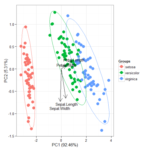
# principal components analysis with the iris data set
# prcomp
ord <- prcomp(iris[, 1:4])

p <- ggord(ord, iris$Species)
p
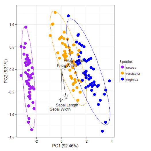
p + scale_colour_manual('Species', values = c('purple', 'orange', 'blue'))
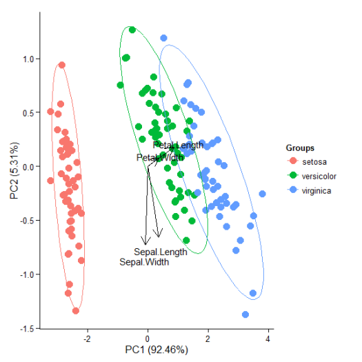
p + theme_classic()
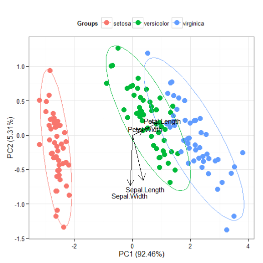
p + theme(legend.position = 'top')
p + scale_x_continuous(limits = c(-2, 2))
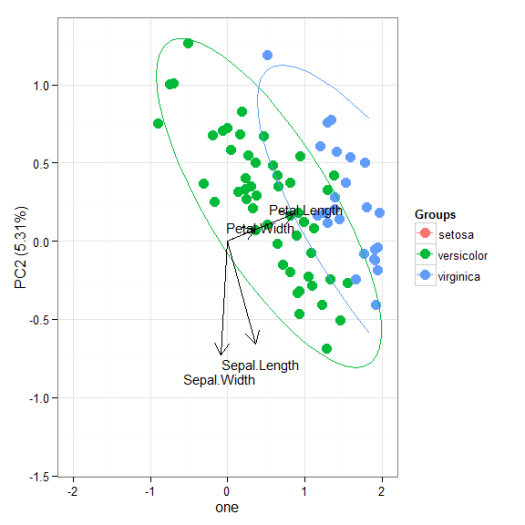
# principal components analysis with the iris dataset
# princomp
ord <- princomp(iris[, 1:4])

ggord(ord, iris$Species)
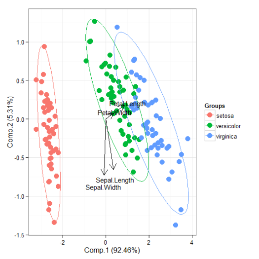
# principal components analysis with the iris dataset
# PCA
library(FactoMineR)

ord <- PCA(iris[, 1:4], graph = FALSE)

ggord(ord, iris$Species)
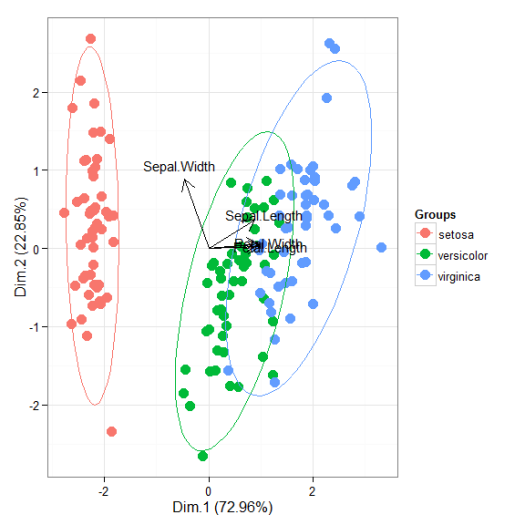
# principal components analysis with the iris dataset
# dudi.pca
library(ade4)

ord <- dudi.pca(iris[, 1:4], scannf = FALSE, nf = 4)

ggord(ord, iris$Species)
# multiple correspondence analysis with the tea dataset
# MCA
data(tea)
tea <- tea[, c('Tea', 'sugar', 'price', 'age_Q', 'sex')]
ord <- MCA(tea[, -1], graph = FALSE)
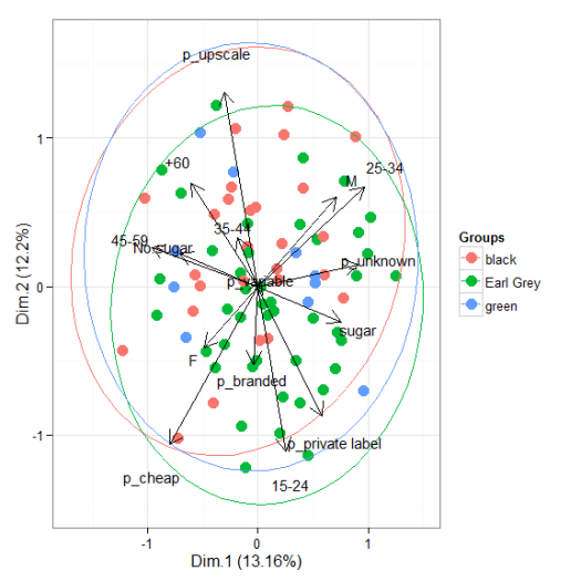
ggord(ord, tea$Tea)
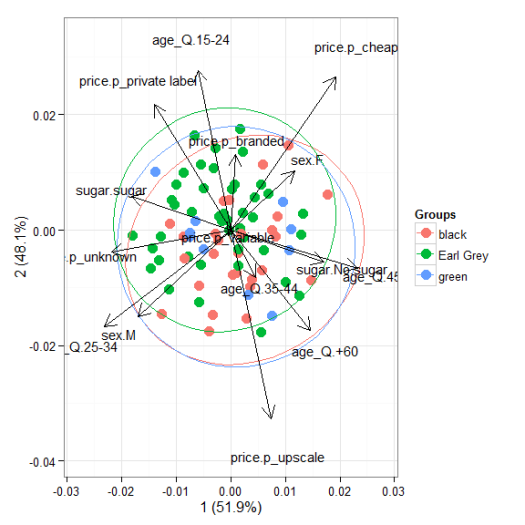
# multiple correspondence analysis with the tea dataset
# mca
library(MASS)

ord <- mca(tea[, -1])

ggord(ord, tea$Tea)
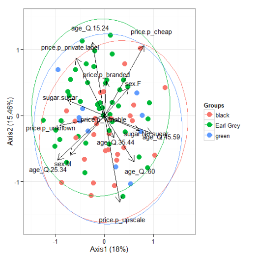
# multiple correspondence analysis with the tea dataset
# acm
ord <- dudi.acm(tea[, -1], scannf = FALSE)

ggord(ord, tea$Tea)
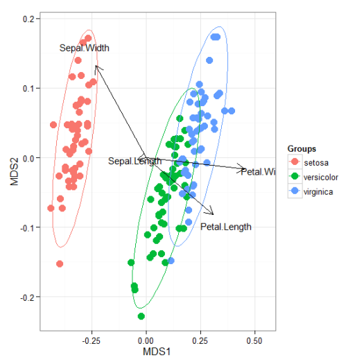
# nonmetric multidimensional scaling with the iris dataset
# metaMDS
library(vegan)
ord <- metaMDS(iris[, 1:4])

ggord(ord, iris$Species)
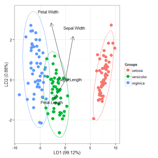
# linear discriminant analysis
# example from lda in MASS package
ord <- lda(Species ~ ., iris, prior = rep(1, 3)/3)

ggord(ord, iris$Species)
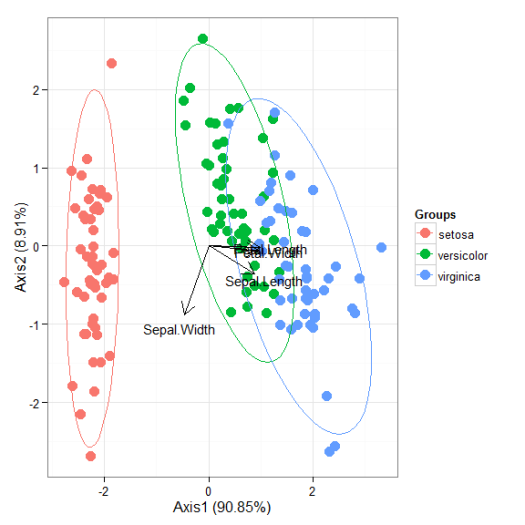
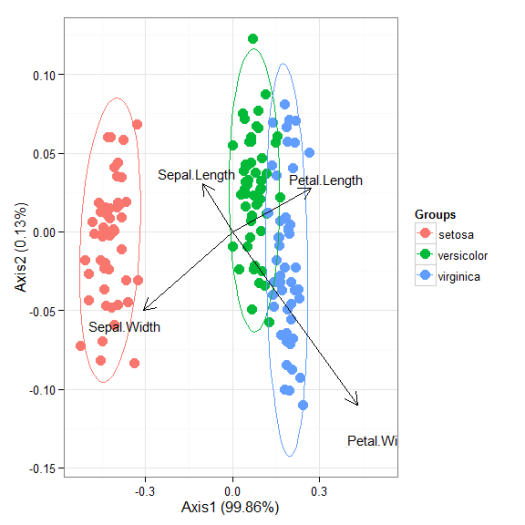
# correspondence analysis
# dudi.coa
ord <- dudi.coa(iris[, 1:4], scannf = FALSE, nf = 4)

ggord(ord, iris$Species)
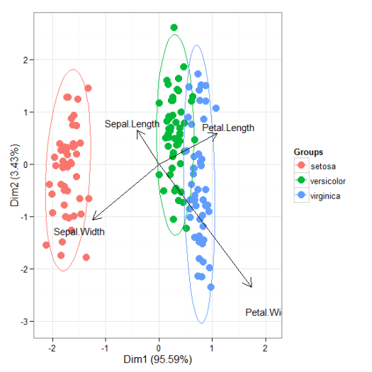
# correspondence analysis
# ca
library(ca)
ord <- ca(iris[, 1:4])

ggord(ord, iris$Species)
Cheers,
Marcus

PCA - FA - MDS | Pearltrees
Distilled News | Data Analytics & R
Adding other methods like you did is actually very useful. The package can be used as a ‘map’ to all these PCA/MCA/etc. functions lying around.
Have you taken a look at this package and that package? Perhaps you could also use
autoplotfunction.Thanks, I hope that at least a few people find these added methods useful… and that even some might contribute! I haven’t seen either of the packages you referenced but the
autoplotfunction looks very useful. I’ll keep it in mind for future updates.Ha that’s really useful! I was just making the same thing when I discovered this. Still a fair few methods that could be included – nipals, principal, factanal, factor.pa, PLS, pcaridge, prm, pcaRes, bfa, rda, NMDS… The ordination methods in the vegan package could perhaps be most useful still. Did you also see the package UBbipl http://www.wiley.com/legacy/wileychi/gower/material.html of the book “Understanding biplots” and the book “Biplots in practice” is also good to check out (can send you the pdf if you wouldn’t have them). Convex hull could be nice alternative for confidence ellipses, or confidence bags, perhaps filled with semi-transp colours as opposed to outlines. Are you planning to send this to CRAN?
Hi Tom,
Thanks for reading and I’m glad you found the package useful. I know the package was missing several methods for other ordination functions in R… and I was hoping that others would fork and contribute to the repo on GitHub. So far, no progress has been made but I’m still hopeful! I don’t have any plans to submit this to CRAN, unless I make significant progress on at least making this inclusive to a majority of the ordination functions in R. Some of the minor suggestions you make would be pretty straightforward to add (convex hull, confidence bags, etc.), so you should put in a request on the issues page if you’d like them included in the develoment repo.
-Marcus
Ha and the equivalent in 3d using rgl would also be cool! I just figured out how to do 3d confidence ellipsoids in fact!
3d would be really cool! I made a really crude version for PCA plots a while ago… might have to dig up that script.
-Marcus
Really cool package! Is it possible to remove the vector arrows from the CA plot in the case of really busy graphs?
Yep, you can do this with the arguments as follows:
This removes both the vectors and the labels. I’d have to change the function to manipulate both, which wouldn’t be hard. You can put in an issue request on the GitHub page if you want this feature.
Quick question- are these all 95% confidence ellipses around the mean? Particularly the CA?
Yes, they are. You can change the confidence level with the ellipse_pro argument, default being 95%.
Thanks! I have a final question (hopefully!!!) Is it possible to change the vector text labels in the LDA, to make them smaller? I can’t figure out whether I need to use MASS or ggplot2 to do so.
Hi!
Very nice (and friendly) pack. I just have a problem, I am getting an awful black spot in the middle of my graph. Is there a way to remove it?
Thanks
Can you post the offending image??
Hi,
Thanks for this very helpful package. I tried to use ‘ggord’ to plot the results of a CCA for a site x species matrix as a function of a four-level categorical variable (edge). All looks fine except that in addition to the points for sites, there are additional points coming up in the plot (a different color from the four categories). I’m wondering if the species scores are being plotted and if so how might I suppress them?
I tried to specify addpts=NULL, but that gave me an error:
Error in ggord.default(obs, vecs = constr, axes, addpts = addpts, …) :
formal argument “addpts” matched by multiple actual arguments
Thanks,
Meghna
Also, I am unable to convert the site points to black with different characters for groups used in the CCA. Any help will be much appreciated.
Hi Meghna,
You can suppress the species points by using addsize = NA. The sites are hard-coded in the function as points, all you can do with the current package is make the points different colors using the grp_in argument. I would need to modify the package to show what you want. You can submit an issue on the GitHub page if you think this feature would be useful.
library(vegan) library(ggord) # data and model data("varechem") data("varespec") ord <- cca(varespec, varechem) # random groups grps <- sample(letters[1:4], nrow(varespec), replace = T) # plot, no species points, color-coded groups at sites ggord(ord, grp_in = grps, addsize = NA)Hi,
Thanks for your feedback; it worked to suppress the points. I had previously done this by specifying addsize = -1, but this is better.
As for black and white, the journal to which I have submitted has steep charges for color images, so I am also trying to make B&W images for the print version.
I think using color for groups looks much clearer than using different characters. However, allowing the possibility of grouping by ‘pch’ might be a helpful feature to replicate from the ordiplot series.
Thanks,
Meghna
Hello, thank you for this really useful package! I was wondering if it is possible to use ggord in a scaterplot matrix setup?
Hi Pamela,
I’m not sure I follow completely, do you mean setup multiple plots in a matrix? If so, you can do this with the gridExtra package.
Hello thank you for your reply,
No I was hoping to plot several different LDAs in a scatterplot matrix. Is it possible to see different combinations of LDs with the ggord funciton? Meaning for example, LD2 vs LD3?
Okay, like this?
library(MASS) library(ggord) ord <- lda(manufacturer ~ displ + cty + hwy, mpg, prior = rep(1, 15)/15) ggord(ord, mpg$manufacturer, axes = c('2', '3'))Yes! That is perfect, thank you so much!
I have one more question…. I saw on comments above about getting rid of the vectors and labels, do you know how to get specific vectors and labels to show up? To eliminate just a couple of them?
No, it’s currently setup as an all or nothing approach. You can do it manually pulling the vector data from the ordination object and adding the vectors to ggord using ggplot geoms.
library(ggord) library(MASS) library(tidyverse) # example from lda in MASS package ord <- lda(Species ~ ., iris, prior = rep(1, 3)/3) # get vectors from ordination object vecs <- ord %>% .$scaling %>% as.data.frame %>% rownames_to_column('var') %>% filter(var %in% c('Petal.Width', 'Sepal.Width')) # get labels for vectors vecs_lab <- ord %>% .$scaling %>% as.data.frame %>% `*`(1.1) %>% rownames_to_column('var') %>% filter(var %in% c('Petal.Width', 'Sepal.Width')) # show only petal and sepal width vectors ggord(ord, iris$Species, vec_ext = 0, txt = NULL, arrow = 0) + geom_segment( data = vecs, aes_string(x = 0, y = 0, xend = 'LD1', yend = 'LD2'), arrow = grid::arrow(length = grid::unit(0.4, "cm")) ) + geom_text(data = vecs_lab, aes_string(x = 'LD1', y = 'LD2', label = 'var'), size = 4 )Thank you. Thank you so much! How do I add credit where credit is due?? I am new to using github and you made my LDA go from so-so to a visually beautiful plot!
Happy to help! You can use the citation on the doi link on the README file: https://zenodo.org/record/1217091#.WzZuUNJKiM8
Marcus W Beck, & Vladimir Mikryukov. (2018, April 11). fawda123/ggord: v1.1.0 (Version v1.1.0). Zenodo. http://doi.org/10.5281/zenodo.1217091
Hello again, I was wondering about one more thing…. how can I get only one group legend to show up for the combined gridarrange plot? Meaning I have 3 plotted LDAs (like the PCA example you posted above) but I only want one legend for all 3 to show up. I looked for suppressing legends in ggord but couldn’t find anything.
That’s more a ggplot thing. You can always suppress a legend by adding the appropriate theme() element to the plot:
library(MASS)
library(ggord)

ord <- lda(manufacturer ~ displ + cty + hwy, mpg, prior = rep(1, 15)/15)
ggord(ord, mpg$manufacturer, axes = c('2', '3')) +
     theme(legend.position = 'none')
The combined plot legend is more tricky and requires lots of hacks. You’ll have to create a ‘fake’ plot that has all of the elements you want to include in the legend, then extract the legend from the plot, and combine all with grid.arrange. This is a royal pain so maybe just consider separate legends? Either way, this code might get you started.
library(ggord) library(ggplot2) library(gridExtra) # get legend from an existing ggplot object g_legend <- function(a.gplot){ tmp <- ggplot_gtable(ggplot_build(a.gplot)) leg <- which(sapply(tmp$grobs, function(x) x$name) == "guide-box") legend <- tmp$grobs[[leg]] return(legend)} # prcomp grp1 <- iris[iris$Species %in% c('setosa', 'versicolor'), ] grp2 <- iris[iris$Species %in% c('setosa', 'virginica'), ] ord1 <- prcomp(grp1[, 1:4]) ord2 <- prcomp(grp2[, 1:4]) ordall <- prcomp(iris[, 1:4]) # plots p1 <- ggord(ord1, grp1$Species, cols = c('red', 'green')) + theme(legend.position = 'none') p2 <- ggord(ord2, grp2$Species, cols = c('red', 'blue')) + theme(legend.position = 'none') # get legend from a plot with all three pleg <- ggord(ordall, iris$Species, cols = c('red', 'green', 'blue')) pleg <- g_legend(pleg) # combin plots with legend grid.arrange( arrangeGrob(p1, p2, ncol = 1), pleg, widths = c(1, 0.2) )How to remove arrows?
ord <- prcomp(iris[, 1:4])
ggord(ord, iris$Species, veccol = NA, ext = 1)
how to install ggord from github pls make installing information step by step
install.packages(‘devtools’)
library(devtools)
install_github(‘fawda123/ggord’)
library(ggord)
Hello! I am using your package to do a correspondence analysis of fatty acid signatures in fish, but Ikam finding the plot very busy and unable to read the species texts (fatty acids) over the individual points (individual fish). Therefore, I am trying to do two plots– one with just the points (fish) and ellipses, and the other with just the species texts (fatty acids). I have figured out the code to do a plot without the species texts and arrows: p<-ggord(ord, CA$Species, arrow=NULL, size = 2, txt = NULL, poly = FALSE), but was wondering how I would be able to do a second plot in which I suppress the points and show just the species text?
I’ve also tried the parse function to see if I could add space to the species text, but I get the error message : Error in parse(text = str) : :1:5: unexpected symbol
1: 16:2n6
^
Hi Em,
You can suppress the points using a negative value for size (or alpha = 0). Something like this could work.
library(ggord) library(patchwork) # principal components analysis with the iris data set ord <- prcomp(iris[, 1:4]) p1 <- ggord(ord, iris$Species, arrow = NULL, txt = NULL) p2 <- ggord(ord, ellipse = F, size = -1) p1 + p2 + plot_layout(ncol = 1)Thank you!
Thanks for the tutorial!
I wanted to make the following changes to my chart:
How to change the order of the caption names?
How to put the name of each species on the chart?
How to change the chart fonts?
Hi Patricia,
You can change the legend order by creating a factor vector for the species. Text labels for each species on the chart requires a data.frame with the locations from the PCA object. However, this is redundant with the legend, so I would not do this. The fonts can be changed with the theme function from ggplot or with the graphics device you’re using to save the plot (the example below shows the latter). Hope that helps.
library(ggord)
library(tidyverse)
library(tibble)

# reorder factor level legend
tomod <- iris
tomod$Species <- factor(tomod$Species, levels = c('virginica', 'setosa', 'versicolor'))

# pca
ord <- prcomp(tomod[, 1:4])

# create data frame for text
txt <- data.frame(ord$x) %>%
  mutate(Species = tomod$Species) %>%
  select('PC1', 'PC2', 'Species') %>%
  group_by(Species) %>%
  summarise(
    PC1 = mean(PC1),
    PC2 = mean(PC2),
    .groups = 'drop'
  )

# create ggord
p <- ggord(ord, grp_in = tomod$Species) +
  geom_text(data = txt, aes(x = PC1, y = PC2, label = Species), col = 'blue')

# save as png
png('~/Desktop/plot.png', family = 'serif', height = 4, width = 7, units = 'in', res = 300)
print(p)
dev.off()