Poor man’s integration – a simulated visualization approach

Every once in a while I encounter a problem that requires the use of calculus. This can be quite bothersome since my brain has refused over the years to retain any useful information related to calculus. Most of my formal training in the dark arts was completed in high school and has not been covered extensively in my post-graduate education. Fortunately, the times when I am required to use calculus are usually limited to the basics, e.g., integration and derivation. If you’re a regular reader of my blog, you’ll know that I often try to make life simpler through the use of R. The focus of this blog is the presentation of a function that can integrate an arbitrarily-defined curve using a less than quantitative approach, or what I like to call, poor man’s integration. If you are up to speed on the basics of calculus, you may recognize this approach as Monte Carlo integration. I have to credit Dr. James Forester (FWCB dept., UMN) for introducing me to this idea.

If you’re like me, you’ll need a bit of a refresher on the basics of integration. Simply put, the area underneath a curve, bounded by some x-values, can be obtained through integration. Most introductory calculus texts will illustrate this concept using a uniform distribution, such as:

f(x)= \left\{     \begin{array}{l l}      0.5 & \quad \textrm{if } 0 \leq x \leq 2 \\      0 & \quad \textrm{otherwise}    \end{array} \right.

If we want to get the area of the curve between, for example 0.5 and 1.5, we find the area of the blue box:

Going back to basic geometry, we know that this is the width (1.5-0.5) multiplied by the height (0.5-0), or 0.5. In calculus terms, this means we’ve integrated the uniform function with the definite integral from 0.5 to 1.5. Integration becomes more complicated with increasingly complex functions and we can’t use simple geometric equations to obtain an answer. For example, let’s define our function as:

f(x)= 1 + x^{2} \quad \textrm{for} {}-\infty < x < {}+\infty

Now we want to integrate the function from -1 to 1 as follows:

Using calculus to find the area:

\begin{array}{lcl}    \int\limits_{{}-1}^{1} f(x)dx & = & \int\limits_{{}-1}^{1} 1 + x^{2} dx \\    & = & \left( 1 + \frac{1}{3}1^{3} \right) - \left({}-1 + \frac{1}{3}\left({}-1\right)^{3} \right)   \\    & = & 1.33 + 1.33 \\    & = & 2.67  \end{array}

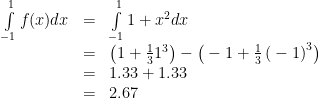
The integrated portion is the area of the curve from negative infinity to 1 minus the area from negative infinity to -1, where the area is determined based on the integrated form of the function, or the antiderivative. The integrate function in R can perform these calculations for you, so long as you define your function properly.

int.fun<-function(x) 1+x^2
integrate(int.fun,-1,1)

The integrate function will return the same value as above, with an indication of error for the estimate. The nice aspect about the integrate function is that it can return integral estimates if the antiderivative has no closed form solution. This is accomplished (from the help file) using ‘globally adaptive interval subdivision in connection with extrapolation by Wynn’s Epsilon algorithm, with the basic step being Gauss–Kronrod quadrature’. I’d rather take a cold shower than figure out what this means. However, I assume the integration involves summing the area of increasingly small polygons across the interval, something like this. The approach I describe here is similar except random points are placed in the interval, rather than columns. The number of points under the curve relative to total number of points is multiplied by the total area that the points cover. The integral estimation approximates the actual as the number of points approaches infinity. After creating this function, I realized that the integrate function can accomplish the same task. However, I’ve incorporated some plotting options for my function to illustrate how the integral is estimated.

Let’s start by creating an arbitrary model for integration. We’ll create random points and then approximate a line of best fit using the loess smoother.

set.seed(3)

x<-seq(1,10)
y<-runif(10,0,20)
dat<-data.frame(x,y)

model<-loess(y~x, data=dat)

The approximated loess model through our random points looks like this:

The antiderivative of the approximated model does not exist in a useful form since the loess function uses local fitting. We can use the integrate function to calculate the area under the curve. The integrate function requires as input a function that takes a numeric first argument and returns a numeric vector of the same length, so we have convert our model accordingly. We’ll approximate the definite integral from 4 to 8.

mod.fun<-function(x) predict(model,newdata=x)
integrate(mod.fun,4,8)

The function tells us that the area under the curve from 4 to 8 is 33.1073 with absolute error < 3.7e-13. Now we can compare this estimate to one obtained using my function. We'll import the mc.int function from Github.

require(devtools)
source_gist(5483807)

This function differs from integrate in a few key ways. The input is an R object model that has a predict (e.g., predict.lm) method, rather than an R function that returns a numeric vector the same length as the input. This is helpful because it eliminates the need to create your own prediction function for your model. Additionally, a plot is produced that shows the simulation data that were used to estimate the integral. Finally, the integration method uses randomly placed points rather than a polygon-based approach. I don’t know enough about integration to speak about the strength and weaknesses of either approach, but the point-based method is more straight-forward (in my opinion).

Let’s integrate our model from 4 to 8 using the mc.int function imported from Github.

mc.int(model,int=c(4,8),round.val=6)

The estimate returned by the function is 32.999005, which is very close to the estimate returned from integrate. The default behavior of mc.int is to return a plot showing the random points that were used to obtain the estimate:

All of the points in green were below the curve. The area where the points were randomly located (x = 4 to x = 8 and y=0 to y=14) was multiplied by the number of green points divided by the total number of points. The function has the following arguments:

mod.in fitted R model object, must have predict method
int two-element numeric vector indicating interval for integration, integrates function across its range if none provided
n numeric vector indicating number of random points to use, default 10000
int.base numeric vector indicating minimum y location for integration, default 0
plot logical value indicating if results should be plotted, default TRUE
plot.pts logical value indicating if random points are plotted, default TRUE
plot.poly logical value indicating if a polygon representing the integration region should be plotted, default TRUE
cols three-element list indicating colors for points above curve, points below curve, and polygon, default ‘black’,’green’, and ‘blue’
round.val numeric vector indicating number of digits for rounding integration estimate, default 2
val logical value indicating if only the estimate is returned with no rounding, default TRUE

Two characteristics of the function are worth noting. First, the integration estimate varies with the total number of points:

Second, the integration estimate changes if we run the function again with the same total number of points since the point locations are chosen randomly:

These two issues represent one drawback of the mc.int function because a measure of certainty is not provided with the integration estimate, unlike the integrate function. However, an evaluation of certainty for an integral with no closed form solution is difficult to obtain because the actual value is not known. Accordingly, we can test the accuracy and precision of the mc.int function to approximate an integral with a known value. For example, the integral of the standard normal distribution from -1.96 to 1.96 is 0.95.

The mc.int function will only be useful if it produces estimates for this integral that are close to 0.95. These estimates should also exhibit minimal variation with repeated random estimates. To evaluate the function, we’ll test an increasing number of random points used to approximate the integral, in addition to repeated number of random estimates for each number of random points. This allows an evaluation of accuracy and precision. The following code evaluated number of random points from 10 to 1000 at intervals of 10, with 500 random samples for each interval. The code uses another function, mc.int.ex, imported from Github that is specific to the standard normal distribution.

#import mc.int.ex function for integration of standard normal
source_gist(5484425)

#get accuracy estimates from mc.int.ex
rand<-500
check.acc<-seq(10,1000,by=10)
mc.dat<-vector('list',length(check.acc))
names(mc.dat)<-check.acc
for(val in check.acc){
	out.int<-numeric(rand)
	for(i in 1:rand){
		cat('mc',val,'rand',i,'\n')
		out.int[i]<-mc.int.ex(n=val,val=T)
		flush.console()
		}
	mc.dat[[as.character(val)]]<-out.int
	}

The median integral estimate, as well as the 2.5th and 97.5th quantile values were obtained for the 500 random samples at each interval (i.e., a non-parametric bootstrap approach). Plotting the estimates as a function of number of random points shows that the integral estimate approaches 0.95 and the precision of the estimate increases with increasing number of points. In fact, an estimate of the integral with 10000 random points and 500 random samples is 0.950027 (0.9333885, 0.9648904).

The function is not perfect but it does provide a reasonable integration estimate if the sample size is sufficiently high. I don’t recommend using this function in place integrate, but it may be useful for visualizing an integration. Feel free to use/modify as you see fit. Cheers!

How long is the average dissertation?

Note: Please see the update to this blog!

The best part about writing a dissertation is finding clever ways to procrastinate. The motivation for this blog comes from one of the more creative ways I’ve found to keep myself from writing. I’ve posted about data mining in the past and this post follows up on those ideas using a topic that is relevant to anyone that has ever considered getting, or has successfully completed, their PhD.

I think a major deterrent that keeps people away from graduate school is the requirement to write a dissertation or thesis. One often hears horror stories of the excessive page lengths that are expected. However, most don’t realize that dissertations are filled with lots of white space, e.g., pages are one-sided, lines are double-spaced, and the author can put any material they want in appendices. The actual written portion may only account for less than 50% of the page length. A single chapter may be 30-40 pages in length, whereas the same chapter published in the primary literature may only be 10 or so pages long in a journal. Regardless, students (myself included) tend to fixate on the ‘appropriate’ page length for a dissertation, as if it’s some sort of measure of how much work you’ve done to get your degree. Any professor will tell you that page length is not a good indicator of the quality of your work. Regardless, I feel that some general page length goal should be established prior to writing. This length could be a minimum to ensure you put forth enough effort, or an upper limit to ensure you aren’t too excessive on extraneous details.

It’s debatable as to what, if anything, page length indicates about the quality of one’s work. One could argue that it indicates absolutely nothing. My advisor once told me about a student in Chemistry that produced a dissertation that was less than five pages, and included nothing more than a molecular equation that illustrated the primary findings of the research. I’ve heard of other advisors that strongly discourage students from creating lengthy dissertations. Like any indicator, page length provides information that may or may not be useful. However, I guarantee that almost every graduate student has thought about an appropriate page length on at least one occasion during their education.

The University of Minnesota library system has been maintaining electronic dissertations since 2007 in their Digital Conservancy website. These digital archives represent an excellent opportunity for data mining. I’ve developed a data scraper that gathers information on student dissertations, such as page length, year and month of graduation, major, and primary advisor. Unfortunately, the code will not work unless you are signed in to the University of Minnesota library system. I’ll try my best to explain what the code does so others can use it to gather data on their own. I’ll also provide some figures showing some relevant data about dissertations. Obviously, this sample is not representative of all institutions or time periods, so extrapolation may be unwise. I also won’t be providing any of the raw data, since it isn’t meant to be accessible for those outside of the University system.

I’ll first show the code to get the raw data for each author. The code returns a list with two elements for each author. The first element has the permanent and unique URL for each author’s data and the second element contains a character string with relevant data to be parsed.

#import package
require(XML)

#starting URL to search
url.in<-'http://conservancy.umn.edu/handle/45273/browse-author?starts_with=0'

#output object
dat<-list()

#stopping criteria for search loop
stp.txt<-'2536-2536 of 2536.'
str.chk<-'foo'

#initiate search loop
while(!grepl(stp.txt,str.chk)){

	html<-htmlTreeParse(url.in,useInternalNodes=T)
	str.chk<-xpathSApply(html,'//p',xmlValue)[3]

	names.tmp<-xpathSApply(html, "//table", xmlValue)[10]
	names.tmp<-gsub("^\\s+", "",strsplit(names.tmp,'\n')[[1]])
	names.tmp<-names.tmp[nchar(names.tmp)>0]

	url.txt<-strsplit(names.tmp,', ')
	url.txt<-lapply(
		url.txt,
		function(x){

			cat(x,'\n')
			flush.console()

			#get permanent handle
			url.tmp<-gsub(' ','+',x)
			url.tmp<-paste(
				'http://conservancy.umn.edu/handle/45273/items-by-author?author=',
				paste(url.tmp,collapse='%2C+'),
				sep=''
				)
			html.tmp<-readLines(url.tmp)
			str.tmp<-rev(html.tmp[grep('handle',html.tmp)])[1]
			str.tmp<-strsplit(str.tmp,'\"')[[1]]
			str.tmp<-str.tmp[grep('handle',str.tmp)] #permanent URL

			#parse permanent handle
			perm.tmp<-htmlTreeParse(
				paste('http://conservancy.umn.edu',str.tmp,sep=''),useInternalNodes=T
				)
			perm.tmp<-xpathSApply(perm.tmp, "//td", xmlValue)
			perm.tmp<-perm.tmp[grep('Major|pages',perm.tmp)]
			perm.tmp<-c(str.tmp,rev(perm.tmp)[1])

			}
		)

	#append data to list, will contain some duplicates
	dat<-c(dat,url.txt)

	#reinitiate url search for next iteration
	url.in<-strsplit(rev(names.tmp)[1],', ')[[1]]
	url.in<-gsub(' ','+',url.in)
	url.in<-paste(
		'http://conservancy.umn.edu/handle/45273/browse-author?top=',
		paste(url.in,collapse='%2C+'),
		sep=''
		)

	}

#remove duplicates
dat<-unique(dat)

The basic approach is to use functions in the XML package to import and parse raw HTML from the web pages on the Digital Conservancy. This raw HTML is then further parsed using some of the base functions in R, such as grep and strsplit. The tricky part is to find the permanent URL for each student that contains the relevant information. I used the ‘browse by author’ search page as a starting point. Each ‘browse by author’ page contains links to 21 individuals. The code first imports the HTML, finds the permanent URL for each author, reads the HTML for each permanent URL, finds the relevant data for each dissertation, then continues with the next page of 21 authors. The loop stops once all records are imported.

The important part is to identify the format of each URL so the code knows where to look and where to re-initiate each search. For example, each author has a permanent URL that has the basic form http://conservancy.umn.edu/ plus ‘handle/12345’, where the last five digits are unique to each author (although the number of digits varied). Once the raw HTML is read in for each page of 21 authors, the code has to find text where the word ‘handle’ appears and then save the following digits to the output object. The permanent URL for each student is then accessed and parsed. The important piece of information for each student takes the following form:

University of Minnesota Ph.D. dissertation. July 2012. Major: Business. Advisor: Jane Doe. 1 computer file (PDF); iv, 147 pages, appendices A-B.

This code is found by searching the HTML for words like ‘Major’ or ‘pages’ after parsing the permanent URL by table cells (using the <td></td> tags). This chunk of text is then saved to the output object for additional parsing.

After the online data were obtained, the following code was used to identify page length, major, month of completion, year of completion, and advisor for each character string for each student. It looks messy but it’s designed to identify the data while handling as many exceptions as I was willing to incorporate into the parsing mechanism. It’s really nothing more than repeated calls to grep using appropriate search terms to subset the character string.

#function for parsing text from website
get.txt<-function(str.in){

	#separate string by spaces
	str.in<-strsplit(gsub(',',' ',str.in,fixed=T),' ')[[1]]
	str.in<-gsub('.','',str.in,fixed=T)

	#get page number
	pages<-str.in[grep('page',str.in)[1]-1]
	if(grepl('appendices|appendix|:',pages)) pages<-NA

	#get major, exception for error
	if(class(try({
		major<-str.in[c(
			grep(':|;',str.in)[1]:(grep(':|;',str.in)[2]-1)
			)]
		major<-gsub('.','',gsub('Major|Mayor|;|:','',major),fixed=T)
		major<-paste(major[nchar(major)>0],collapse=' ')

		}))=='try-error') major<-NA

	#get year of graduation
	yrs<-seq(2006,2013)
	yr<-str.in[grep(paste(yrs,collapse='|'),str.in)[1]]
	yr<-gsub('Major|:','',yr)
	if(!length(yr)>0) yr<-NA

	#get month of graduation
	months<-c('January','February','March','April','May','June','July','August',
		'September','October','November','December')
	month<-str.in[grep(paste(months,collapse='|'),str.in)[1]]
	month<-gsub('dissertation|dissertatation|\r\n|:','',month)
	if(!length(month)>0) month<-NA

	#get advisor, exception for error
	if(class(try({
		advis<-str.in[(grep('Advis',str.in)+1):(grep('computer',str.in)-2)]
		advis<-paste(advis,collapse=' ')
		}))=='try-error') advis<-NA

	#output text
	c(pages,major,yr,month,advis)

	}

#get data using function, ran on 'dat'
check.pgs<-do.call('rbind',
	lapply(dat,function(x){
		cat(x[1],'\n')
		flush.console()
		c(x[1],get.txt(x[2]))})
		)

#convert to dataframe
check.pgs<-as.data.frame(check.pgs,sringsAsFactors=F)
names(check.pgs)<-c('handle','pages','major','yr','month','advis')

#reformat some vectors for analysis
check.pgs$pages<-as.numeric(as.character(check.pgs$pages))
check.pgs<-na.omit(check.pgs)
months<-c('January','February','March','April','May','June','July','August',
		'September','October','November','December')
check.pgs$month<-factor(check.pgs$month,months,months)
check.pgs$major<-tolower(check.pgs$major)

The section of the code that begins with #get data using function takes the online data (stored as dat on my machine) and applies the function to identify the relevant information. The resulting text is converted to a data frame and some minor reworkings are applied to convert some vectors to numeric or factor values. Now the data are analyzed using the check.pgs object.

The data contained 2,536 records for students that completed their dissertations since 2007. The range was incredibly variable (minimum of 21 pages, maximum of 2002), but most dissertations were around 100 to 200 pages.

Interestingly, a lot of students graduated in August just prior to the fall semester. As expected, spikes in defense dates were also observed in December and May at the ends of the fall and spring semesters.

The top four majors with the most dissertations on record were (in descending order) educational policy and administration, electrical engineering, educational psychology, and psychology.

I’ve selected the top fifty majors with the highest number of dissertations and created boxplots to show relative distributions. Not many differences are observed among the majors, although some exceptions are apparent. Economics, mathematics, and biostatistics had the lowest median page lengths, whereas anthropology, history, and political science had the highest median page lengths. This distinction makes sense given the nature of the disciplines.

I’ve also completed a count of number of students per advisor. The maximum number of students that completed their dissertations for a single advisor since 2007 was eight. Anyhow, I’ve satiated my curiosity on this topic so it’s probably best that I actually work on my own dissertation rather than continue blogging. For those interested, the below code was used to create the plots.

######
#plot summary of data
require(ggplot2)

mean.val<-round(mean(check.pgs$pages))
med.val<-median(check.pgs$pages)
sd.val<-round(sd(check.pgs$pages))
rang.val<-range(check.pgs$pages)
txt.val<-paste('mean = ',mean.val,'\nmed = ',med.val,'\nsd = ',sd.val,
	'\nmax = ',rang.val[2],'\nmin = ', rang.val[1],sep='')

#histogram for all
hist.dat<-ggplot(check.pgs,aes(x=pages))
pdf('C:/Users/Marcus/Desktop/hist_all.pdf',width=7,height=5)
hist.dat + geom_histogram(aes(fill=..count..),binwidth=10) +
  scale_fill_gradient("Count", low = "blue", high = "green") +
	xlim(0, 500) + geom_text(aes(x=400,y=100,label=txt.val))
dev.off()

#barplot by month
month.bar<-ggplot(check.pgs,aes(x=month,fill=..count..))

pdf('C:/Users/Marcus/Desktop/month_bar.pdf',width=10,height=5.5)
month.bar + geom_bar() + scale_fill_gradient("Count", low = "blue", high = "green")
dev.off()

######
#histogram by most popular majors
#sort by number of dissertations by major
get.grps<-list(c(1:4),c(5:8))#,c(9:12),c(13:16))

for(val in 1:length(get.grps)){

	pop.maj<-names(sort(table(check.pgs$major),decreasing=T)[get.grps[[val]]])
	pop.maj<-check.pgs[check.pgs$major %in% pop.maj,]
	pop.med<-aggregate(pop.maj$pages,list(pop.maj$major),function(x) round(median(x)))
	pop.n<-aggregate(pop.maj$pages,list(pop.maj$major),length)

	hist.maj<-ggplot(pop.maj, aes(x=pages))
	hist.maj<-hist.maj + geom_histogram(aes(fill = ..count..), binwidth=10)
	hist.maj<-hist.maj + facet_wrap(~major,nrow=2,ncol=2) + xlim(0, 500) +
		scale_fill_gradient("Count", low = "blue", high = "green")

	y.txt<-mean(ggplot_build(hist.maj)$panel$ranges[[1]]$y.range)
	txt.dat<-data.frame(
		x=rep(450,4),
	  y=rep(y.txt,4),
		major=pop.med$Group.1,
		lab=paste('med =',pop.med$x,'\nn =',pop.n$x,sep=' ')
	  )

	hist.maj<-hist.maj + geom_text(data=txt.dat, aes(x=x,y=y,label=lab))

	out.name<-paste('C:/Users/Marcus/Desktop/group_hist',val,'.pdf',sep='')
	pdf(out.name,width=9,height=7)

	print(hist.maj)

	dev.off()

	}

######
#boxplots of data for fifty most popular majors

pop.maj<-names(sort(table(check.pgs$major),decreasing=T)[1:50])
pop.maj<-check.pgs[check.pgs$major %in% pop.maj,]

pdf('C:/Users/Marcus/Desktop/pop_box.pdf',width=11,height=9)
box.maj<-ggplot(pop.maj, aes(factor(major), pages, fill=pop.maj$major))
box.maj<-box.maj + geom_boxplot(lwd=0.5) + ylim(0,500) + coord_flip()
box.maj + theme(legend.position = "none", axis.title.y=element_blank())
dev.off()

Update: By popular request, I’ve redone the boxplot summary with major sorted by median page length.

A nifty line plot to visualize multivariate time series

A few days ago a colleague came to me for advice on the interpretation of some data. The dataset was large and included measurements for twenty-six species at several site-year-plot combinations. A substantial amount of effort had clearly been made to ensure every species at every site over several years was documented. I don’t pretend to hide my excitement of handling large, messy datasets, so I offered to lend a hand. We briefly discussed a few options and came to the conclusion that simple was better, at least in an exploratory sense. The challenge was to develop a plot that was informative, but also maintained the integrity of the data. Specifically, we weren’t interested in condensing information using synthetic axes created from a multivariate soup. We wanted some way to quickly identify trends over time for multiple species.

I was directed towards the excellent work by the folks at Gallup and Healthways to create a human ‘well-being index’ or WBI. This index is a composite of six different sub-indices (e.g., physical health, work environment, etc.) that provides a detailed and real-time view of American health. The annual report provides many examples of elegant and informative graphs, which we used as motivation for our current problem. In particular, page 6 of the report has a figure on the right-hand side that shows the changes in state WBI rankings from 2011 to 2012. States are ranked by well-being in descending order with lines connecting states between the two years. One could obtain the same conclusions by examining a table but the figure provides a visually pleasing and entertaining way of evaluating several pieces of information.

I’ll start by explaining the format of the data we’re using. After preparation of the raw data with plyr and reshape2 by my colleague, a dataset was created with multiple rows for each time step and multiple columns for species, indexed by site. After splitting the data frame by site (using split), the data contained only the year and species data. The rows contained species frequency occurrence values for each time step. Here’s an example for one site (using random data):

step sp1 sp2 sp3 sp4
2003 1.3 2.6 7.7 3.9
2004 3.9 4.2 2.5 1.6
2005 0.4 2.6 3.3 11.0
2006 6.9 10.9 10.5 8.4

The actual data contained a few dozen species, not to mention multiple tables for each site. Sites were also designated as treatment or control. Visual examination of each table to identify trends related to treatment was not an option given the abundance of the data for each year and site.

We’ll start by creating a synthetic dataset that we’ll want to visualize. We’ll pretend that the data are for one site, since the plot function described below handles sites individually.

#create random data
set.seed(5)

#time steps
step<-as.character(seq(2007,2012))

#species names
sp<-paste0('sp',seq(1,25))

#random data for species frequency occurrence
sp.dat<-runif(length(step)*length(sp),0,15)

#create data frame for use with plot
sp.dat<-matrix(sp.dat,nrow=length(step),ncol=length(sp))
sp.dat<-data.frame(step,sp.dat)
names(sp.dat)<-c('step',sp)

The resulting data frame contains six years of data (by row) with randomized data on frequency occurrence for 25 species (every column except the first). In order to make the plot interesting, we can induce a correlation of some of our variables with the time steps. Otherwise, we’ll be looking at random data which wouldn’t show the full potential of the plots. Let’s randomly pick four of the variables and replace their values. Two variables will decrease with time and two will increase.

#reassign values of four variables

#pick random species names
vars<-sp[sp %in% sample(sp,4)]

#function for getting value at each time step
time.fun<-function(strt.val,steps,mean.val,lim.val){
	step<-1
	x.out<-strt.val
	while(step<steps){
		x.new<-x.out[step] + rnorm(1,mean=mean.val)
		x.out<-c(x.out,x.new)
		step<-step+1
		}
	if(lim.val<=0) return(pmax(lim.val,x.out))
	else return(pmin(lim.val,x.out))
	}

#use function to reassign variable values
sp.dat[,vars[1]]<-time.fun(14.5,6,-3,0) #start at 14.5, decrease rapidly
sp.dat[,vars[2]]<-time.fun(13.5,6,-1,0) #start at 13.5, decrease less rapidly
sp.dat[,vars[3]]<-time.fun(0.5,6,3,15) #start at 0.5, increase rapidly
sp.dat[,vars[4]]<-time.fun(1.5,6,1,15) #start at 1.5, increase less rapidly

The code uses the sample function to pick the species in the data frame. Next, I’ve written a function that simulates random variables that either decrease or increase for a given number of time steps. The arguments for the function are strt.val for the initial starting value at the first time step, steps are the total number of time steps to return, mean.val determines whether the values increase or decrease with the time steps, and lim.val is an upper or lower limit for the values. Basically, the function returns values at each time step that increase or decrease by a random value drawn from a normal distribution with mean as mean.val. Obviously we could enter the data by hand, but this way is more fun. Here’s what the data look like.

Now we can use the plot to visualize changes in species frequency occurrence for the different time steps. We start by importing the function, named plot.qual, into our workspace.

require(devtools)
source_gist('5281518')

par(mar=numeric(4),family='serif')
plot.qual(sp.dat,rs.ln=c(3,15))

The figure shows species frequency occurrence from 2007 to 2012. Species are ranked in order of decreasing frequency occurrence for each year, with year labels above each column. The lines connect the species between the years. Line color is assigned based on the ranked frequency occurrence values for species in the first time step to allow better identification of a species across time. Line width is also in proportion to the starting frequency occurrence value for each species at each time step. The legend on the bottom indicates the frequency occurrence values for different line widths.

We can see how the line colors and widths help us follow species trends. For example, we randomly chose species two to decrease with time. In 2007, we see that species two is ranked as the highest frequency occurrence among all species. We see a steady decline for each time step if we follow the species through the years. Finally, species two was ranked the lowest in 2012. The line widths also decrease for species two at each time step, illustrating the continuous decrease in frequency occurrence. Similarly, we randomly chose species 15 to increase with each time step. We see that it’s second to lowest in 2007 and then increases to third highest by 2012.

We can use the sp.names argument to isolate species of interest. We can clearly see the changes we’ve defined for our four random species.

plot.qual(sp.dat,sp.names=vars)

In addition to requiring the RColorBrewer and scales packages, the plot.qual function has several arguments that affect plotting:

x data frame or matrix with input data, first column is time step
x.locs minimum and maximum x coordinates for plotting region, from 0–1
y.locs minimum and maximum y coordinates for plotting region, from 0–1
steps character string of time steps to include in plot, default all
sp.names character string of species connections to display, default all
dt.tx logical value indicating if time steps are indicated in the plot
rsc logical value indicating if line widths are scaled proportionally to their value
ln.st numeric value for distance of lines from text labels, distance is determined automatically if not provided
rs.ln two-element numeric vector for rescaling line widths, defaults to one value if one element is supplied, default 3 to 15
ln.cl character string indicating color of lines, can use multiple colors or input to brewer.pal, default ‘RdYlGn’
alpha.val numeric value (0–1) indicating transparency of connections, default 0.7
leg logical value for plotting legend, default T, values are for the original data frame, no change for species or step subsets
rnks logical value for showing only the ranks in the text labels
... additional arguments to plot

I’ve attempted to include some functionality in the arguments, such as the ability to include date names and a legend, control over line widths, line color and transparency, and which species or years are shown. A useful aspect of the line coloring is the ability to incorporate colors from RColorBrewer or multiple colors as input to colorRampPalette. The following plots show some of these features.

par(mar=c(0,0,1,0),family='serif')
plot.qual(sp.dat,rs.ln=6,ln.cl='black',alpha=0.5,dt.tx=F,
	main='No color, no legend, no line rescaling')
#legend is removed if no line rescaling

par(mfrow=c(1,2),mar=c(0,0,1,0),family='serif')
plot.qual(sp.dat,steps=c('2007','2012'),x.locs=c(0.1,0.9),leg=F)
plot.qual(sp.dat,steps=c('2007','2012'),sp.names=vars,x.locs=c(0.1,0.9),leg=F)
title('Plot first and last time step for different species',outer=T,line=-1)

par(mar=c(0,0,1,0),family='serif')
plot.qual(sp.dat,y.locs=c(0.05,1),ln.cl=c('lightblue','purple','green'),
	main='Custom color ramp')

These plots are actually nothing more than glorified line plots, but I do hope the functionality and display helps better visualize trends over time. However, an important distinction is that the plots show ranked data rather than numerical changes in frequency occurrence as in a line plot. For example, species twenty shows a decrease in rank from 2011 to 2012 (see the second plot) yet the actual data in the table shows a continuous increase across all time steps. This does not represent an error in the plot, rather it shows a discrepancy between viewing data qualitatively or quantitatively. In other words, always be aware of what a figure actually shows you.

Please let me know if any bugs are encountered or if there are any additional features that could improve the function. Feel free to grab the code here.