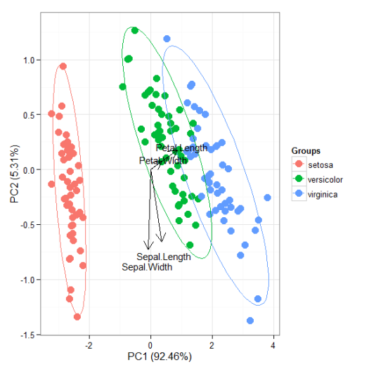
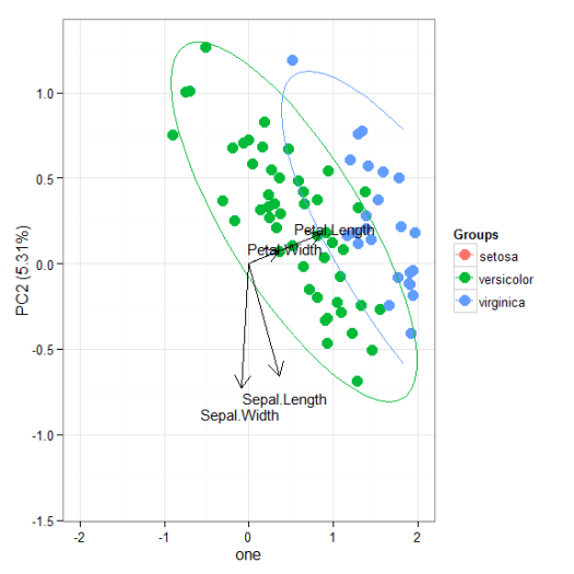
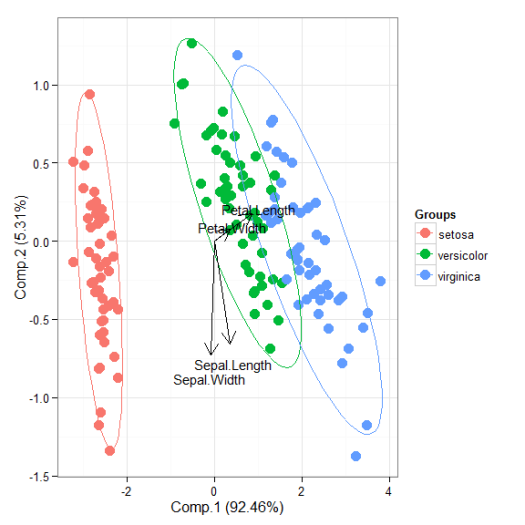
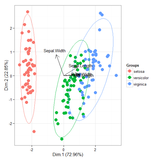
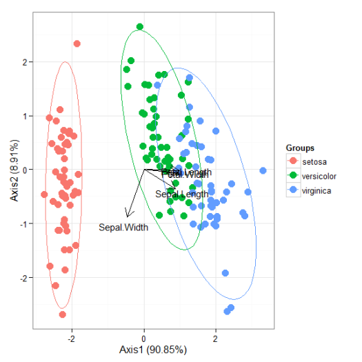
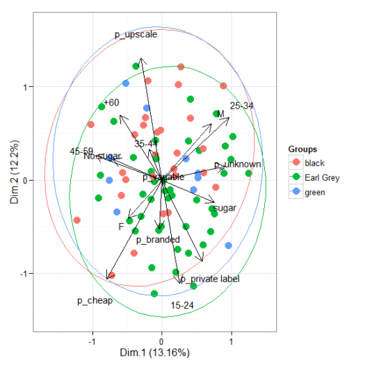
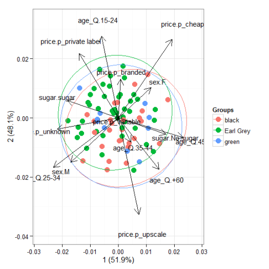
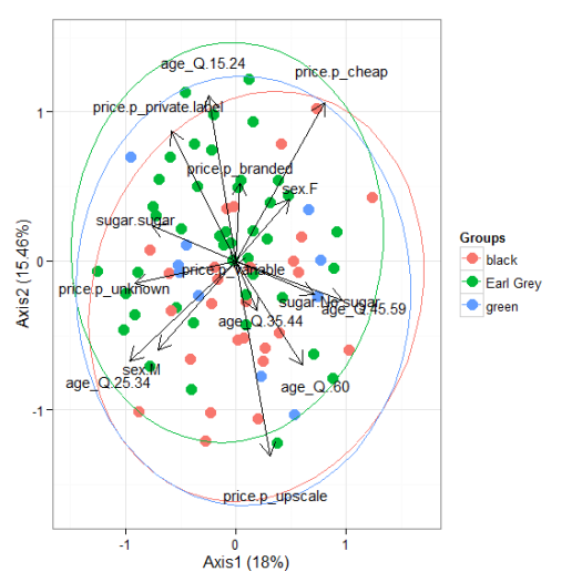
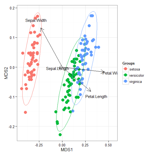
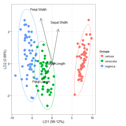
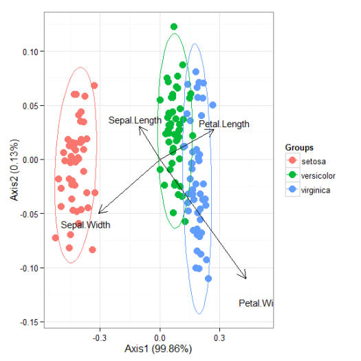
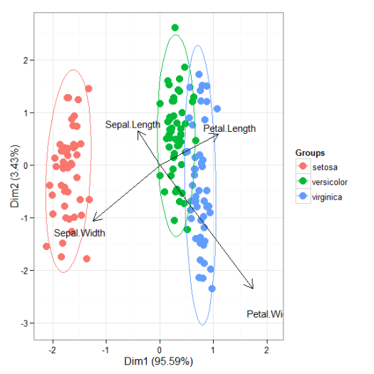
I’ll be the first to admit that the topic of plotting ordination results using ggplot2 has been visited many times over. As is my typical fashion, I started creating a package for this purpose without completely searching for existing solutions. Specifically, the ggbiplot and factoextra packages already provide almost complete coverage of plotting results from multivariate and ordination analyses in R. Being the stubborn individual, I couldn’t give up on my own package so I started exploring ways to improve some of the functionality of biplot methods in these existing packages. For example, ggbiplot and factoextra work almost exclusively with results from principal components analysis, whereas numerous other multivariate analyses can be visualized using the biplot approach. I started to write methods to create biplots for some of the more common ordination techniques, in addition to all of the functions I could find in R that conduct PCA. This exercise became very boring very quickly so I stopped adding methods after the first eight or so. That being said, I present this blog as a sinking ship that was doomed from the beginning, but I’m also hopeful that these functions can be built on by others more ambitious than myself.
The process of adding methods to a default biplot function in ggplot was pretty simple and not the least bit interesting. The default ggpord biplot function (see here) is very similar to the default biplot function from the stats base package. Only two inputs are used, the first being a two column matrix of the observation scores for each axis in the biplot and the second being a two column matrix of the variable scores for each axis. Adding S3 methods to the generic function required extracting the relevant elements from each model object and then passing them to the default function. Easy as pie but boring as hell.
I’ll repeat myself again. This package adds nothing new to the functionality already provided by ggbiplot and factoextra. However, I like to think that I contributed at least a little bit by adding more methods to the biplot function. On top of that, I’m also naively hopeful that others will be inspired to fork my package and add methods. Here you can view the raw code for the ggord default function and all methods added to that function. Adding more methods is straightforward, but I personally don’t have any interest in doing this myself. So who wants to help??
Visit the package repo here or install the package as follows.
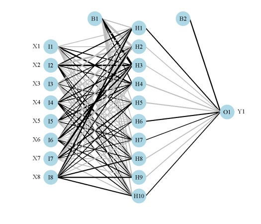
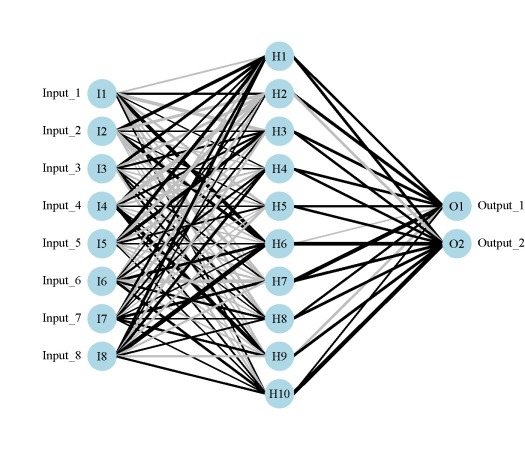
In my last post I said I wasn’t going to write anymore about neural networks (i.e., multilayer feedforward perceptron, supervised ANN, etc.). That was a lie. I’ve received several requests to update the neural network plotting function described in the original post. As previously explained, R does not provide a lot of options for visualizing neural networks. The only option I know of is a plotting method for objects from the neuralnet package. This may be my opinion, but I think this plot leaves much to be desired (see below). Also, no plotting methods exist for neural networks created in other packages, i.e., nnet and RSNNS. These packages are the only ones listed on the CRAN task view, so I’ve updated my original plotting function to work with all three. Additionally, I’ve added a new option for plotting a raw weight vector to allow use with neural networks created elsewhere. This blog describes these changes, as well as some new arguments added to the original function.
Fig: A neural network plot created using functions from the neuralnet package.
As usual, I’ll simulate some data to use for creating the neural networks. The dataset contains eight input variables and two output variables. The final dataset is a data frame with all variables, as well as separate data frames for the input and output variables. I’ve retained separate datasets based on the syntax for each package.
The various neural network packages are used to create separate models for plotting.
#nnet function from nnet package
library(nnet)
set.seed(seed.val)
mod1<-nnet(rand.vars,resp,data=dat.in,size=10,linout=T)

#neuralnet function from neuralnet package, notice use of only one response
library(neuralnet)
form.in<-as.formula('Y1~X1+X2+X3+X4+X5+X6+X7+X8')
set.seed(seed.val)
mod2<-neuralnet(form.in,data=dat.in,hidden=10)

#mlp function from RSNNS package
library(RSNNS)
set.seed(seed.val)
mod3<-mlp(rand.vars, resp, size=10,linOut=T)
I’ve noticed some differences between the functions that could lead to some confusion. For simplicity, the above code represents my interpretation of the most direct way to create a neural network in each package. Be very aware that direct comparison of results is not advised given that the default arguments differ between the packages. A few key differences are as follows, although many others should be noted. First, the functions differ in the methods for passing the primary input variables. The nnet function can take separate (or combined) x and y inputs as data frames or as a formula, the neuralnet function can only use a formula as input, and the mlp function can only take a data frame as combined or separate variables as input. As far as I know, the neuralnet function is not capable of modelling multiple response variables, unless the response is a categorical variable that uses one node for each outcome. Additionally, the default output for the neuralnet function is linear, whereas the opposite is true for the other two functions.
Specifics aside, here’s how to use the updated plot function. Note that the same syntax is used to plot each model.
#import the function from Github
library(devtools)
source_url('https://gist.githubusercontent.com/fawda123/7471137/raw/466c1474d0a505ff044412703516c34f1a4684a5/nnet_plot_update.r')

#plot each model
plot.nnet(mod1)
plot.nnet(mod2)
plot.nnet(mod3)
Fig: A neural network plot using the updated plot function and a nnet object (mod1).Fig: A neural network plot using the updated plot function and a neuralnet object (mod2).Fig: A neural network plot using the updated plot function and a mlp object (mod3).
The neural networks for each model are shown above. Note that only one response variable is shown for the second plot. Also, neural networks created using mlp do not show bias layers, causing a warning to be returned. The documentation about bias layers for this function is lacking, although I have noticed that the model object returned by mlp does include information about ‘unitBias’ (see the output from mod3$snnsObject$getUnitDefinitions()). I wasn’t sure what this was so I excluded it from the plot. Bias layers aren’t all that informative anyway, since they are analogous to intercept terms in a regression model. Finally, the default variable labels differ for the mlp plot from the other two. I could not find any reference to the original variable names in the mlp object, so generic names returned by the function are used.
I have also added five new arguments to the function. These include options to remove bias layers, remove variable labels, supply your own variable labels, and include the network architecture if using weights directly as input. The new arguments are shown in bold.
mod.in
neural network object or numeric vector of weights, if model object must be from nnet, mlp, or neuralnet functions
nid
logical value indicating if neural interpretation diagram is plotted, default T
all.out
character string indicating names of response variables for which connections are plotted, default all
all.in
character string indicating names of input variables for which connections are plotted, default all
bias
logical value indicating if bias nodes and connections are plotted, not applicable for networks from mlp function, default T
wts.only
logical value indicating if connections weights are returned rather than a plot, default F
rel.rsc
numeric value indicating maximum width of connection lines, default 5
circle.cex
numeric value indicating size of nodes, passed to cex argument, default 5
node.labs
logical value indicating if labels are plotted directly on nodes, default T
var.labs
logical value indicating if variable names are plotted next to nodes, default T
x.lab
character string indicating names for input variables, default from model object
y.lab
character string indicating names for output variables, default from model object
line.stag
numeric value that specifies distance of connection weights from nodes
struct
numeric value of length three indicating network architecture(no. nodes for input, hidden, output), required only if mod.in is a numeric vector
cex.val
numeric value indicating size of text labels, default 1
alpha.val
numeric value (0-1) indicating transparency of connections, default 1
circle.col
character string indicating color of nodes, default ‘lightblue’, or two element list with first element indicating color of input nodes and second indicating color of remaining nodes
pos.col
character string indicating color of positive connection weights, default ‘black’
neg.col
character string indicating color of negative connection weights, default ‘grey’
max.sp
logical value indicating if space between nodes in each layer is maximized, default F
...
additional arguments passed to generic plot function
The plotting function can also now be used with an arbitrary weight vector, rather than a specific model object. The struct argument must also be included if this option is used. I thought the easiest way to use the plotting function with your own weights was to have the input weights as a numeric vector, including bias layers. I’ve shown how this can be done using the weights directly from mod1 for simplicity.
Note that wts.in is a numeric vector with length equal to the expected given the architecture (i.e., for 8 10 2 network, 100 connection weights plus 12 bias weights). The plot should look the same as the plot for the neural network from nnet.
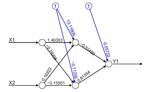
The weights in the input vector need to be in a specific order for correct plotting. I realize this is not clear by looking directly at wt.in but this was the simplest approach I could think of. The weight vector shows the weights for each hidden node in sequence, starting with the bias input for each node, then the weights for each output node in sequence, starting with the bias input for each output node. Note that the bias layer has to be included even if the network was not created with biases. If this is the case, simply input a random number where the bias values should go and use the argument bias=F. I’ll show the correct order of the weights using an example with plot.nn from the neuralnet package since the weights are included directly on the plot.
Fig: Example from the neuralnet package showing model weights.
If we pretend that the above figure wasn’t created in R, we would input the mod.in argument for the updated plotting function as follows. Also note that struct must be included if using this approach.
mod.in<-c(13.12,1.49,0.16,-0.11,-0.19,-0.16,0.56,-0.52,0.81)
struct<-c(2,2,1) #two inputs, two hidden, one output
plot.nnet(mod.in,struct=struct)
Fig: Use of the plot.nnet function by direct input of model weights.
Note the comparability with the figure created using the neuralnet package. That is, larger weights have thicker lines and color indicates sign (+ black, – grey).
One of these days I’ll actually put these functions in a package. In the mean time, please let me know if any bugs are encountered.
Cheers,
Marcus
Update:
I’ve changed the function to work with neural networks created using the train function from the caret package. The link above is updated but you can also grab it here.
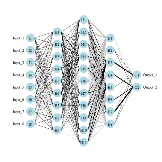
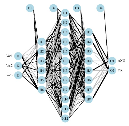
More updates… I’ve now modified the function to plot multiple hidden layers for networks created using the mlp function in the RSNNS package and neuralnet in the neuralnet package. As far as I know, these are the only neural network functions in R that can create multiple hidden layers. All others use a single hidden layer. I have not tested the plotting function using manual input for the weight vectors with multiple hidden layers. My guess is it won’t work but I can’t be bothered to change the function unless it’s specifically requested. The updated function can be grabbed here (all above links to the function have also been changed).
library(RSNNS)

#neural net with three hidden layers, 9, 11, and 8 nodes in each
mod<-mlp(rand.vars, resp, size=c(9,11,8),linOut=T)
par(mar=numeric(4),family='serif')
plot.nnet(mod)
Fig: Use of the updated plot.nnet function with multiple hidden layers from a network created with mlp.
Here’s an example using the neuralnet function with binary predictors and categorical outputs (credit to Tao Ma for the model code).
Fig: Use of the updated plot.nnet function with multiple hidden layers from a network created with neuralnet.
Update 3:
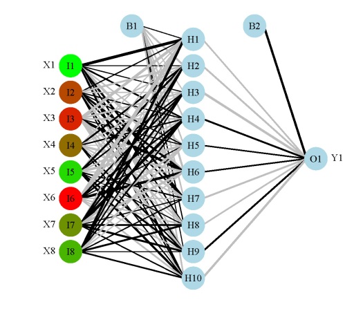
The color vector argument (circle.col) for the nodes was changed to allow a separate color vector for the input layer. The following example shows how this can be done using relative importance of the input variables to color-code the first layer.
#example showing use of separate colors for input layer
#color based on relative importance using 'gar.fun'

##
#create input data
seed.val<-3
set.seed(seed.val)

num.vars<-8
num.obs<-1000

#input variables
library(clusterGeneration)
cov.mat<-genPositiveDefMat(num.vars,covMethod=c("unifcorrmat"))$Sigma
rand.vars<-mvrnorm(num.obs,rep(0,num.vars),Sigma=cov.mat)

#output variables
parms<-runif(num.vars,-10,10)
y1<-rand.vars %*% matrix(parms) + rnorm(num.obs,sd=20)

#final datasets
rand.vars<-data.frame(rand.vars)
resp<-data.frame(y1)
names(resp)<-'Y1'
dat.in<-data.frame(resp,rand.vars)

##
#create model
library(nnet)
mod1<-nnet(rand.vars,resp,data=dat.in,size=10,linout=T)

##
#relative importance function
library(devtools)
source_url('https://gist.github.com/fawda123/6206737/raw/2e1bc9cbc48d1a56d2a79dd1d33f414213f5f1b1/gar_fun.r')

#relative importance of input variables for Y1
rel.imp<-gar.fun('Y1',mod1,bar.plot=F)$rel.imp

#color vector based on relative importance of input values
cols<-colorRampPalette(c('green','red'))(num.vars)[rank(rel.imp)]

##
#plotting function
source_url('https://gist.githubusercontent.com/fawda123/7471137/raw/466c1474d0a505ff044412703516c34f1a4684a5/nnet_plot_update.r')

#plot model with new color vector
#separate colors for input vectors using a list for 'circle.col'
plot(mod1,circle.col=list(cols,'lightblue'))
Fig: Use of the updated plot.nnet function with input nodes color-coded in relation to relative importance.
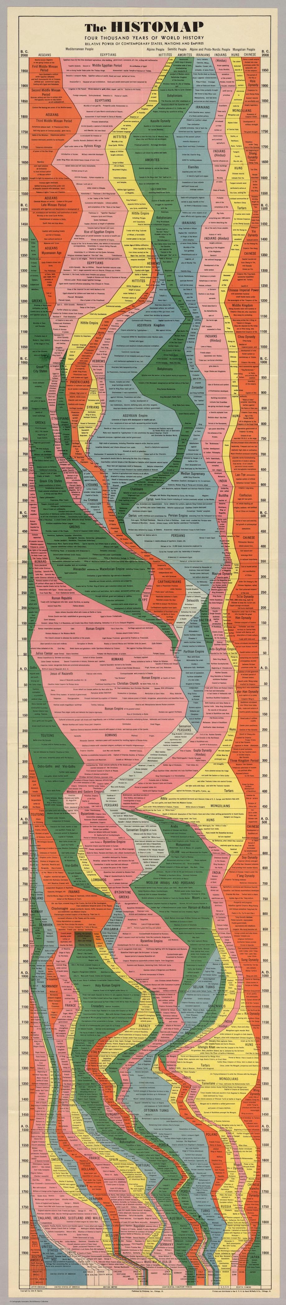
The ideas for most of my blogs usually come from half-baked attempts to create some neat or useful feature that hasn’t been implemented in R. These ideas might come from some analysis I’ve used in my own research or from some other creation meant to save time. More often than not, my blogs are motivated by data visualization techniques meant to provide useful ways of thinking about analysis results or comparing pieces of information. I was particularly excited (anxious?) after I came across this really neat graphic that ambitiously portrays the progression of civilization since ca. BC 2000. The original image was created John B. Sparks and was first printed by Rand McNally in 1931.1 The ‘Histomap’ illustrates the rise and fall of various empires and civilizations through an increasing time series up to present day. Color-coded chunks at each time step indicate the relative importance or dominance of each group. Although the methodology by which ‘relative dominance’ was determined is unclear, the map provides an impressive synopsis of human history.
Fig: Snippet of the histomap. See the footnote for full link.1
Historical significance aside, I couldn’t help but wonder if a similar figure could be reproduced in R (I am not a historian). I started work on a function to graphically display the relative importance of categorical data across a finite time series. After a few hours of working, I soon realized that plot functions in the ggplot2 package can already accomplish this task. Specifically, the geom_area ‘geom’ provides a ‘continuous analog of a stacked bar chart, and can be used to show how composition of the whole varies over the range of x’.2 I wasn’t the least bit surprised that this functionality was already available in ggplot2. Rather than scrapping my function entirely, I decided to stay the course in the naive hope that a stand-alone function that was independent of ggplot2 might be useful. Consider this blog my attempt at ripping-off some ideas from Hadley Wickham.
The first question that came to mind when I started the function was the type of data to illustrate. The data should illustrate changes in relative values (abundance?) for different categories or groups across time. The only assumption is that the relative values are all positive. Here’s how I created some sample data:
#create data
set.seed(3)

#time steps
t.step<-seq(0,20)

#group names
grps<-letters[1:10]

#random data for group values across time
grp.dat<-runif(length(t.step)*length(grps),5,15)

#create data frame for use with plot
grp.dat<-matrix(grp.dat,nrow=length(t.step),ncol=length(grps))
grp.dat<-data.frame(grp.dat,row.names=t.step)
names(grp.dat)<-grps
The code creates random data from a uniform distribution for ten groups of variables across twenty time steps. The approach is similar to the method used in my blog about a nifty line plot. The data defined here can also be used with the line plot as an alternative approach for visualization. The only difference between this data format and the latter is that the time steps in this example are the row names, rather than a separate column. The difference is trivial but in hindsight I should have kept them the same for compatibility between plotting functions. The data have the following form for the first four groups and first three time steps.
a
b
c
d
0
6.7
5.2
6.7
6.0
1
13.1
6.3
10.7
12.7
2
8.8
5.9
9.2
8.0
3
8.3
7.4
7.7
12.7
The plotting function, named plot.area, can be imported and implemented as follows (or just copy from the link):
The function indicates the relative values of each group as a proportion from 0-1 by default. The function arguments are as follows:
x
data frame with input data, row names are time steps
col
character string of at least one color vector for the groups, passed to colorRampPalette, default is ‘lightblue’ to ‘green’
horiz
logical indicating if time steps are arranged horizontally, default F
prop
logical indicating if group values are displayed as relative proportions from 0–1, default T
stp.ln
logical indicating if parallel lines are plotted indicating the time steps, defualt T
grp.ln
logical indicating if lines are plotted connecting values of individual groups, defualt T
axs.cex
font size for axis values, default 1
axs.lab
logical indicating if labels are plotted on each axis, default T
lab.cex
font size for axis labels, default 1
names
character string of length three indicating axis names, default ‘Group’, ‘Step’, ‘Value’
...
additional arguments to passed to par
I arbitrarily chose the color scheme as a ramp from light blue to green. Any combination of color values as input to colorRampPalette can be used. Individual colors for each group will be used if the number of input colors is equal to the number of groups. Here’s an example of another color ramp.
Fig: The plot.area function with changing arguments for prop and horiz.
Now is a useful time to illustrate how these graphs can be replicated in ggplot2. After some quick reshaping of our data, we can create a similar plot as above (full code here):
require(ggplot2)
require(reshape)

#reshape the data
p.dat<-data.frame(step=row.names(grp.dat),grp.dat,stringsAsFactors=F)
p.dat<-melt(p.dat,id='step')
p.dat$step<-as.numeric(p.dat$step)

#create plots
p<-ggplot(p.dat,aes(x=step,y=value)) + theme(legend.position="none")
p + geom_area(aes(fill=variable))
p + geom_area(aes(fill=variable),position='fill')
Fig: The ggplot2 approach to plotting the data.
Same plots, right? My function is practically useless given the tools in ggplot2. However, the plot.area function is completely independent, allowing for easy manipulation of the source code. I’ll leave it up to you to decide which approach is most useful.
If you’re a regular reader of my blog you’ll know that I’ve spent some time dabbling with neural networks. As I explained here, I’ve used neural networks in my own research to develop inference into causation. Neural networks fall under two general categories that describe their intended use. Supervised neural networks (e.g., multilayer feed-forward networks) are generally used for prediction, whereas unsupervised networks (e.g., Kohonen self-organizing maps) are used for pattern recognition. This categorization partially describes the role of the analyst during model development. For example, a supervised network is developed from a set of known variables and the end goal of the model is to match the predicted output values with the observed via ‘supervision’ of the training process by the analyst. Development of unsupervised networks are conducted independently from the analyst in the sense that the end product is not known and no direct supervision is required to ensure expected or known results are obtained. Although my research objectives were not concerned specifically with prediction, I’ve focused entirely on supervised networks given the number of tools that have been developed to gain insight into causation. Most of these tools have been described in the primary literature but are not available in R.
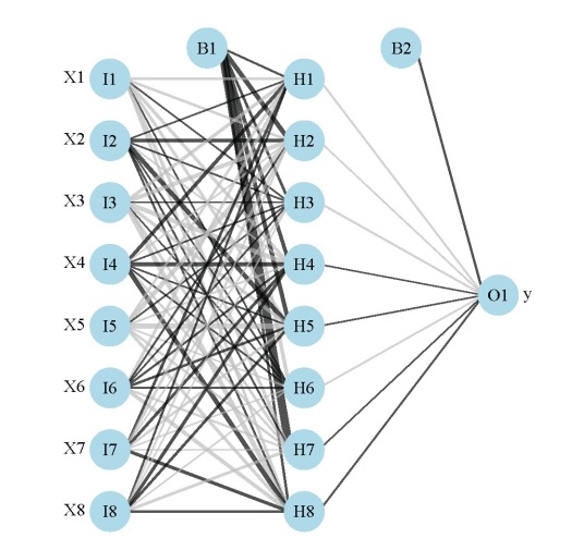
My previous post on neural networks described a plotting function that can be used to visually interpret a neural network. Variables in the layers are labelled, in addition to coloring and thickening of weights between the layers. A general goal of statistical modelling is to identify the relative importance of explanatory variables for their relation to one or more response variables. The plotting function is used to portray the neural network in this manner, or more specifically, it plots the neural network as a neural interpretation diagram (NID)1. The rationale for use of an NID is to provide insight into variable importance by visually examining the weights between the layers. For example, input (explanatory) variables that have strong positive associations with response variables are expected to have many thick black connections between the layers. This qualitative interpretation can be very challenging for large models, particularly if the sign of the weights switches after passing the hidden layer. I have found the NID to be quite useless for anything but the simplest models.
Fig: A neural interpretation diagram for a generic neural network. Weights are color-coded by sign (black +, grey -) and thickness is in proportion to magnitude. The plot function can be obtained here.
The weights that connect variables in a neural network are partially analogous to parameter coefficients in a standard regression model and can be used to describe relationships between variables. That is, the weights dictate the relative influence of information that is processed in the network such that input variables that are not relevant in their correlation with a response variable are suppressed by the weights. The opposite effect is seen for weights assigned to explanatory variables that have strong, positive associations with a response variable. An obvious difference between a neural network and a regression model is that the number of weights is excessive in the former case. This characteristic is advantageous in that it makes neural networks very flexible for modeling non-linear functions with multiple interactions, although interpretation of the effects of specific variables is of course challenging.
A method proposed by Garson 19912 (also Goh 19953) identifies the relative importance of explanatory variables for specific response variables in a supervised neural network by deconstructing the model weights. The basic idea is that the relative importance (or strength of association) of a specific explanatory variable for a specific response variable can be determined by identifying all weighted connections between the nodes of interest. That is, all weights connecting the specific input node that pass through the hidden layer to the specific response variable are identified. This is repeated for all other explanatory variables until the analyst has a list of all weights that are specific to each input variable. The connections are tallied for each input node and scaled relative to all other inputs. A single value is obtained for each explanatory variable that describes the relationship with response variable in the model (see the appendix in Goh 1995 for a more detailed description). The original algorithm presented in Garson 1991 indicated relative importance as the absolute magnitude from zero to one such the direction of the response could not be determined. I modified the approach to preserve the sign, as you’ll see below.
We start by creating a neural network model (using the nnet package) from simulated data before illustrating use of the algorithm. The model is created from eight input variables, one response variable, 10000 observations, and an arbitrary correlation matrix that describes relationships between the explanatory variables. A set of randomly chosen parameters describe the relationship of the response variable with the explanatory variables.
require(clusterGeneration)
require(nnet)

#define number of variables and observations
set.seed(2)
num.vars<-8
num.obs<-10000

#define correlation matrix for explanatory variables
#define actual parameter values
cov.mat<-genPositiveDefMat(num.vars,covMethod=c("unifcorrmat"))$Sigma
rand.vars<-mvrnorm(num.obs,rep(0,num.vars),Sigma=cov.mat)
parms<-runif(num.vars,-10,10)
y<-rand.vars %*% matrix(parms) + rnorm(num.obs,sd=20)

#prep data and create neural network
y<-data.frame((y-min(y))/(max(y)-min(y)))
names(y)<-'y'
rand.vars<-data.frame(rand.vars)
mod1<-nnet(rand.vars,y,size=8,linout=T)
The function for determining relative importance is called gar.fun and can be imported from my Github account (gist 6206737). The function reverse depends on the plot.nnet function to get the model weights.
#import 'gar.fun' from Github
source_url('https://gist.githubusercontent.com/fawda123/6206737/raw/d6f365c283a8cae23fb20892dc223bc5764d50c7/gar_fun.r')
The function is very simple to implement and has the following arguments:
out.var
character string indicating name of response variable in the neural network object to be evaluated, only one input is allowed for models with multivariate response
mod.in
model object for input created from nnet function
bar.plot
logical value indicating if a figure is also created in the output, default T
x.names
character string indicating alternative names to be used for explanatory variables in the figure, default is taken from mod.in
...
additional arguments passed to the bar plot function
The function returns a list with three elements, the most important of which is the last element named rel.imp. This element indicates the relative importance of each input variable for the named response variable as a value from -1 to 1. From these data, we can get an idea of what the neural network is telling us about the specific importance of each explanatory for the response variable. Here’s the function in action:
#create a pretty color vector for the bar plot
cols<-colorRampPalette(c('lightgreen','lightblue'))(num.vars)
#use the function on the model created above
par(mar=c(3,4,1,1),family='serif')
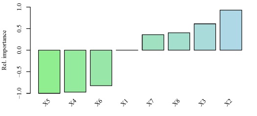
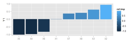
gar.fun('y',mod1,col=cols,ylab='Rel. importance',ylim=c(-1,1))
#output of the third element looks like this
# $rel.imp
# X1 X2 X3 X4 X5
# 0.0000000 0.9299522 0.6114887 -0.9699019 -1.0000000
# X6 X7 X8
# -0.8217887 0.3600374 0.4018899
Fig: Relative importance of the eight explanatory variables for response variable y using the neural network created above. Relative importance was determined using methods in Garson 19912 and Goh 19953. The function can be obtained here.
The output from the function and the bar plot tells us that the variables X5 and X2 have the strongest negative and positive relationships, respectively, with the response variable. Similarly, variables that have relative importance close to zero, such as X1, do not have any substantial importance for y. Note that these values indicate relative importance such that a variable with a value of zero will most likely have some marginal effect on the response variable, but its effect is irrelevant in the context of the other explanatory variables.
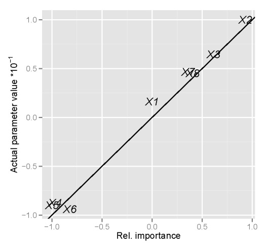
An obvious question of concern is whether these indications of relative importance provide similar information as the true relationships between the variables we’ve defined above. Specifically, we created the response variable y as a linear function of the explanatory variables based on a set of randomly chosen parameters (parms). A graphical comparison of the indications of relative importance with the true parameter values is as follows:
Fig: Relative importance of the eight explanatory variables for response variable y compared to the true parameter values defined above. Parameter values were divided by ten to facilitate comparison.
We assume that concordance between the true parameter values and the indications of relative importance is indicated by similarity between the two, which is exactly what is seen above. We can say with certainty that the neural network model and the function to determine relative importance is providing us with reliable information. A logical question to ask next is whether or not using a neural network provides more insight into variable relationships than a standard regression model, since we know our response variable follows the general form of a linear regression. An interesting exercise could compare this information for a response variable that is more complex than the one we’ve created above, e.g., add quadratic terms, interactions, etc.
As far as I know, Garson’s algorithm has never been modified to preserve the sign of the relationship between variables. This information is clearly more useful than simply examining the magnitude of the relationship, as is the case with the original algorithm. I hope the modified algorithm will be useful for facilitating the use of neural networks to infer causation, although it must be acknowledged that a neural network is ultimately based on correlation and methods that are more heavily based in theory could be more appropriate. Lastly, I consider this blog my contribution to dispelling the myth that neural networks are black boxes (motivated by Olden and Jackson 20024). Useful information can indeed be obtained with the right tools.
-Marcus
1Özesmi, S.L., Özesmi, U. 1999. An artificial neural network approach to spatial habitat modeling with interspecific interaction. Ecological Modelling. 116:15-31. 2Garson, G.D. 1991. Interpreting neural network connection weights. Artificial Intelligence Expert. 6(4):46–51. 3Goh, A.T.C. 1995. Back-propagation neural networks for modeling complex systems. Artificial Intelligence in Engineering. 9(3):143–151. 4Olden, J.D., Jackson, D.A. 2002. Illuminating the ‘black-box’: a randomization approach for understanding variable contributions in artificial neural networks. Ecological Modelling. 154:135-150.
Update:
I’m currently updating all of the neural network functions on my blog to make them compatible with all neural network packages in R. Additionally, the functions will be able to use raw weight vectors as inputs, in addition to model objects as currently implemented. The updates to the gar.fun function include these options. See the examples below for more details. I’ve also changed the plotting to use ggplot2 graphics.
The new arguments for gar.fun are as follows:
out.var
character string indicating name of response variable in the neural network object to be evaluated, only one input is allowed for models with multivariate response, must be of form ‘Y1’, ‘Y2’, etc. if using numeric values as weight inputs for mod.in
mod.in
model object for neural network created using the nnet, RSNNS, or neuralnet packages, alternatively, a numeric vector specifying model weights in specific order, see example
bar.plot
logical value indicating if a figure or relative importance values are returned, default T
struct
numeric vector of length three indicating structure of the neural network, e.g., 2, 2, 1 for two inputs, two hidden, and one response, only required if mod.in is a vector input
x.lab
character string indicating alternative names to be used for explanatory variables in the figure, default is taken from mod.in
y.lab
character string indicating alternative names to be used for response variable in the figure, default is taken from out.var
wts.only
logical indicating of only model weights should be returned
Fig: Relative importance using the updated function, obtained here.Fig: Relative importance using a different ggplot2 theme.
The user has the responsibility to make sure the weight vector is in the correct order if raw weights are used as input. The function will work if all weights are provided but there is no method for identifying the correct order. The names of the weights in the commented code above describe the correct order, e.g., Hidden 1 11 is the bias layer weight going to hidden node 1, Hidden 1 12 is the first input going to the first hidden node, etc. The first number is an arbitrary place holder indicating the first hidden layer. The correct structure must also be provided for the given length of the input weight vector. NA values should be used if no bias layers are included in the model. Stay tuned for more updates as I continue revising these functions.
My last post discussed a technique for integrating functions in R using a Monte Carlo or randomization approach. The mc.int function (available here) estimated the area underneath a curve by multiplying the proportion of random points below the curve by the total area covered by points within the interval:
The estimated integration (bottom plot) is not far off from the actual (top plot). The estimate will converge on the actual as the point count reaches infinity. A useful feature of the function is the ability to visualize the integration of a model with no closed form solution for the anti-derivative, such as a loess smooth. I return to the idea of visualizing integrations for this blog using an alternative approach to estimate an integral. I’ve also incorporated this new function using a Shiny interface that allows the user to interactively explore the integration of different functions. I’m quite happy with how it turned out and I think the interface could be useful for anyone trying to learn integration.
The approach I use in this blog estimates an integral using a quadrature or column-based technique (an example). You’ll be familiar with this method if you’ve ever taken introductory calculus. The basic approach is to estimate the integral by summing the area of columns or rectangles that fill the approximate area under the curve. The accuracy of the estimate increases with decreasing column width such that the estimate approaches the actual value as column width approaches zero. An advantage of the approach is ease of calculation. The estimate is simply the sum of column areas determined as width times height. As in my last blog, this is a rudimentary approach that can only approximate the actual integral. R has several methods to more quantitatively approximate an integration, although options for visualization are limited.
The following illustrates use of a column-based approach such that column width decreases over the range of the interval:
The figure illustrates the integral of a standard normal curve from -1.96 to 1.96. We see that the area begins to approximate 0.95 with decreasing column width. All columns are bounded by the integral and the midpoint of each column is centered on an observed value from the function. The figures were obtained using the column.int function developed for this blog, which can be imported into your workspace as follows:
require(devtools)
source_gist(5568685)
In addition to the devtools package (to import from github), you’ll need to have the ggplot2, scales (which will install with ggplot2), and gridExtra packages installed. You’ll be prompted to install the packages if you don’t have them. Once the function is loaded in your workspace, you can run it as follows (using the default arguments):
column.int()
The function defaults to a standard normal curve integrated from -1.96 to 1.96 using twenty columns. The estimated area is projected as the plot title. The arguments for the function as are as follows:
int.fun
function to be integrated, entered as a character string or as class function, default ‘dnorm(x)’
num.poly
numeric vector indicating number of columns to use for integration, default 20
from.x
numeric vector indicating starting x value for integration, default -1.96
to.x
numeric vector indicating ending x value for integration, default 1.96
plot.cum
logical value indicating if a second plot is included that shows cumulative estimated integration with increasing number of columns up to num.poly, default FALSE
The plot.cum argument allows us to visualize the accuracy of our estimated integration. A second plot is included that shows the integration obtained from the integrate function (as a dashed line and plot title), as well as the integral estimate with increasing number of columns from one to num.poly using the column.int function. Obviously we would like to have enough columns to ensure our estimate is reasonably accurate.
column.int(plot.cum=T)
Our estimate converges rapidly to 0.95 with increasing number of columns. The estimated value will be very close to 0.95 with decreasing column width but be aware that computation time increases exponentially. An estimate with 20 columns takes less than a quarter second, whereas an estimate with 1000 columns takes 2.75 seconds. If we include a cumulative plot (plot.cum=T), the processing time is 0.47 seconds for 20 columns and three minutes 37 seconds for 1000 columns. Also be aware that the accuracy of the estimate will vary depending on the function. For the normal function, it’s easy to see how columns provide a reasonable approximation of the integral. This may not be the case for other functions:
Now that you’ve got a feel for the function, I’ll introduce the Shiny interface. As an aside, this is my first attempt using Shiny and I am very impressed with its functionality. Much respect to the creators for making this application available. You can access the interface clicking the image below:
If you prefer, you can also load the interface locally one of two ways:
You can also access the code for the original function below. Anyhow, I hope this is useful to some of you. I would be happy to entertain suggestions for improving the functionality of this tool.
A few days ago a colleague came to me for advice on the interpretation of some data. The dataset was large and included measurements for twenty-six species at several site-year-plot combinations. A substantial amount of effort had clearly been made to ensure every species at every site over several years was documented. I don’t pretend to hide my excitement of handling large, messy datasets, so I offered to lend a hand. We briefly discussed a few options and came to the conclusion that simple was better, at least in an exploratory sense. The challenge was to develop a plot that was informative, but also maintained the integrity of the data. Specifically, we weren’t interested in condensing information using synthetic axes created from a multivariate soup. We wanted some way to quickly identify trends over time for multiple species.
I was directed towards the excellent work by the folks at Gallup and Healthways to create a human ‘well-being index’ or WBI. This index is a composite of six different sub-indices (e.g., physical health, work environment, etc.) that provides a detailed and real-time view of American health. The annual report provides many examples of elegant and informative graphs, which we used as motivation for our current problem. In particular, page 6 of the report has a figure on the right-hand side that shows the changes in state WBI rankings from 2011 to 2012. States are ranked by well-being in descending order with lines connecting states between the two years. One could obtain the same conclusions by examining a table but the figure provides a visually pleasing and entertaining way of evaluating several pieces of information.
I’ll start by explaining the format of the data we’re using. After preparation of the raw data with plyr and reshape2 by my colleague, a dataset was created with multiple rows for each time step and multiple columns for species, indexed by site. After splitting the data frame by site (using split), the data contained only the year and species data. The rows contained species frequency occurrence values for each time step. Here’s an example for one site (using random data):
step
sp1
sp2
sp3
sp4
2003
1.3
2.6
7.7
3.9
2004
3.9
4.2
2.5
1.6
2005
0.4
2.6
3.3
11.0
2006
6.9
10.9
10.5
8.4
The actual data contained a few dozen species, not to mention multiple tables for each site. Sites were also designated as treatment or control. Visual examination of each table to identify trends related to treatment was not an option given the abundance of the data for each year and site.
We’ll start by creating a synthetic dataset that we’ll want to visualize. We’ll pretend that the data are for one site, since the plot function described below handles sites individually.
#create random data
set.seed(5)

#time steps
step<-as.character(seq(2007,2012))

#species names
sp<-paste0('sp',seq(1,25))

#random data for species frequency occurrence
sp.dat<-runif(length(step)*length(sp),0,15)

#create data frame for use with plot
sp.dat<-matrix(sp.dat,nrow=length(step),ncol=length(sp))
sp.dat<-data.frame(step,sp.dat)
names(sp.dat)<-c('step',sp)
The resulting data frame contains six years of data (by row) with randomized data on frequency occurrence for 25 species (every column except the first). In order to make the plot interesting, we can induce a correlation of some of our variables with the time steps. Otherwise, we’ll be looking at random data which wouldn’t show the full potential of the plots. Let’s randomly pick four of the variables and replace their values. Two variables will decrease with time and two will increase.
#reassign values of four variables

#pick random species names
vars<-sp[sp %in% sample(sp,4)]

#function for getting value at each time step
time.fun<-function(strt.val,steps,mean.val,lim.val){
	step<-1
	x.out<-strt.val
	while(step<steps){
		x.new<-x.out[step] + rnorm(1,mean=mean.val)
		x.out<-c(x.out,x.new)
		step<-step+1
		}
	if(lim.val<=0) return(pmax(lim.val,x.out))
	else return(pmin(lim.val,x.out))
	}

#use function to reassign variable values
sp.dat[,vars[1]]<-time.fun(14.5,6,-3,0) #start at 14.5, decrease rapidly
sp.dat[,vars[2]]<-time.fun(13.5,6,-1,0) #start at 13.5, decrease less rapidly
sp.dat[,vars[3]]<-time.fun(0.5,6,3,15) #start at 0.5, increase rapidly
sp.dat[,vars[4]]<-time.fun(1.5,6,1,15) #start at 1.5, increase less rapidly
The code uses the sample function to pick the species in the data frame. Next, I’ve written a function that simulates random variables that either decrease or increase for a given number of time steps. The arguments for the function are strt.val for the initial starting value at the first time step, steps are the total number of time steps to return, mean.val determines whether the values increase or decrease with the time steps, and lim.val is an upper or lower limit for the values. Basically, the function returns values at each time step that increase or decrease by a random value drawn from a normal distribution with mean as mean.val. Obviously we could enter the data by hand, but this way is more fun. Here’s what the data look like.
Now we can use the plot to visualize changes in species frequency occurrence for the different time steps. We start by importing the function, named plot.qual, into our workspace.
The figure shows species frequency occurrence from 2007 to 2012. Species are ranked in order of decreasing frequency occurrence for each year, with year labels above each column. The lines connect the species between the years. Line color is assigned based on the ranked frequency occurrence values for species in the first time step to allow better identification of a species across time. Line width is also in proportion to the starting frequency occurrence value for each species at each time step. The legend on the bottom indicates the frequency occurrence values for different line widths.
We can see how the line colors and widths help us follow species trends. For example, we randomly chose species two to decrease with time. In 2007, we see that species two is ranked as the highest frequency occurrence among all species. We see a steady decline for each time step if we follow the species through the years. Finally, species two was ranked the lowest in 2012. The line widths also decrease for species two at each time step, illustrating the continuous decrease in frequency occurrence. Similarly, we randomly chose species 15 to increase with each time step. We see that it’s second to lowest in 2007 and then increases to third highest by 2012.
We can use the sp.names argument to isolate species of interest. We can clearly see the changes we’ve defined for our four random species.
plot.qual(sp.dat,sp.names=vars)
In addition to requiring the RColorBrewer and scales packages, the plot.qual function has several arguments that affect plotting:
x
data frame or matrix with input data, first column is time step
x.locs
minimum and maximum x coordinates for plotting region, from 0–1
y.locs
minimum and maximum y coordinates for plotting region, from 0–1
steps
character string of time steps to include in plot, default all
sp.names
character string of species connections to display, default all
dt.tx
logical value indicating if time steps are indicated in the plot
rsc
logical value indicating if line widths are scaled proportionally to their value
ln.st
numeric value for distance of lines from text labels, distance is determined automatically if not provided
rs.ln
two-element numeric vector for rescaling line widths, defaults to one value if one element is supplied, default 3 to 15
ln.cl
character string indicating color of lines, can use multiple colors or input to brewer.pal, default ‘RdYlGn’
alpha.val
numeric value (0–1) indicating transparency of connections, default 0.7
leg
logical value for plotting legend, default T, values are for the original data frame, no change for species or step subsets
rnks
logical value for showing only the ranks in the text labels
...
additional arguments to plot
I’ve attempted to include some functionality in the arguments, such as the ability to include date names and a legend, control over line widths, line color and transparency, and which species or years are shown. A useful aspect of the line coloring is the ability to incorporate colors from RColorBrewer or multiple colors as input to colorRampPalette. The following plots show some of these features.
par(mar=c(0,0,1,0),family='serif')
plot.qual(sp.dat,rs.ln=6,ln.cl='black',alpha=0.5,dt.tx=F,
	main='No color, no legend, no line rescaling')
#legend is removed if no line rescaling
par(mfrow=c(1,2),mar=c(0,0,1,0),family='serif')
plot.qual(sp.dat,steps=c('2007','2012'),x.locs=c(0.1,0.9),leg=F)
plot.qual(sp.dat,steps=c('2007','2012'),sp.names=vars,x.locs=c(0.1,0.9),leg=F)
title('Plot first and last time step for different species',outer=T,line=-1)
par(mar=c(0,0,1,0),family='serif')
plot.qual(sp.dat,y.locs=c(0.05,1),ln.cl=c('lightblue','purple','green'),
	main='Custom color ramp')
These plots are actually nothing more than glorified line plots, but I do hope the functionality and display helps better visualize trends over time. However, an important distinction is that the plots show ranked data rather than numerical changes in frequency occurrence as in a line plot. For example, species twenty shows a decrease in rank from 2011 to 2012 (see the second plot) yet the actual data in the table shows a continuous increase across all time steps. This does not represent an error in the plot, rather it shows a discrepancy between viewing data qualitatively or quantitatively. In other words, always be aware of what a figure actually shows you.
Please let me know if any bugs are encountered or if there are any additional features that could improve the function. Feel free to grab the code here.


